In this article, we are going to see how to support dynamic updates to Facebook Image Layout Algorithm. Beware, this is not an easy task and there are many special cases to handle πŸ™‚

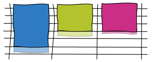
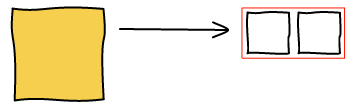
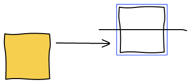
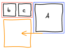
Making images bigger

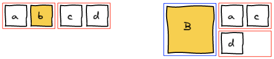
To make images bigger we just run the algorithm all over again with the new image being big. For example, making b big will lead to the following layout.

In order to make it a better user experience, we want to smoothly transition the images positions and sizes. We do it using CSS Transitions. In Javascript, we update the size and dimension of all the elements and add 2 lines of CSS to get the magic.

transition-property: top, left, width, height;
transition-duration: 500ms;
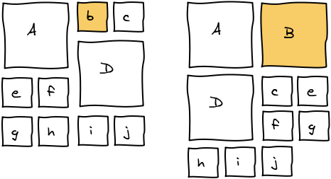
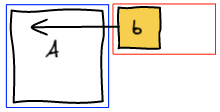
Reordering

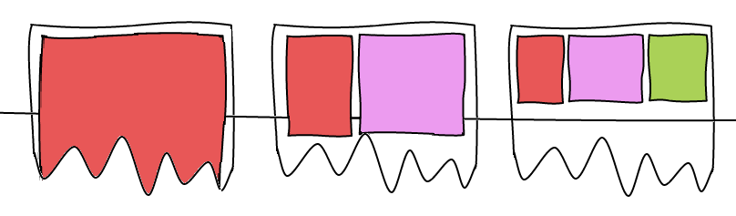
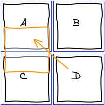
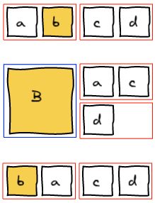
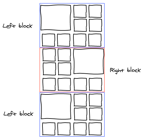
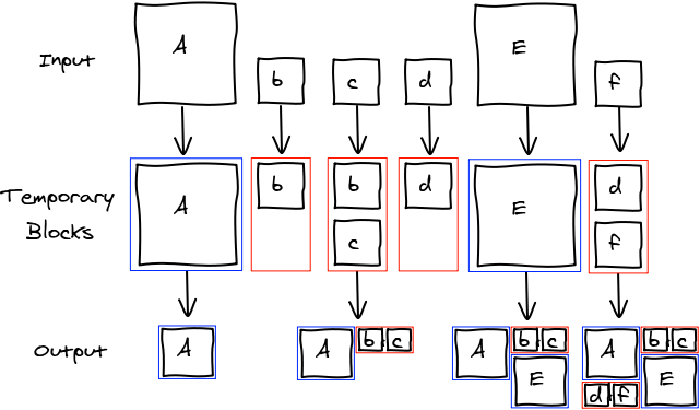
Let's start with a small example. We want to move b where d is.

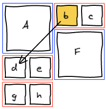
The first thing we do is to remove b from the list of elements. Then, we rerun layout algorithm until we are about to add a block at the spot where we want b to be.

Insert Before

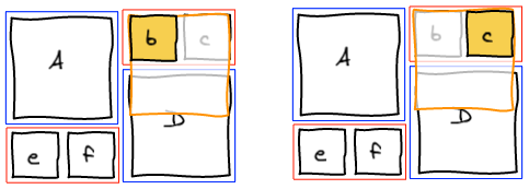
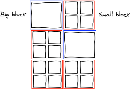
At this point, we realize that b needs to be at the spot where e is. The natural answer is to insert b right before e and re-run the layout algorithm.

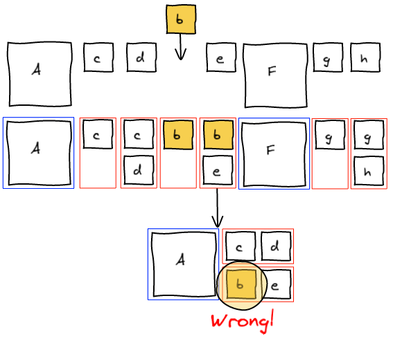
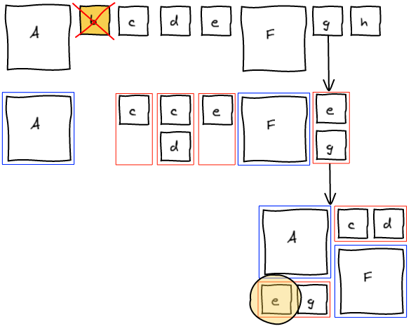
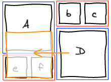
However this is not working as expected. Adding b before e groups them together before F.

Insert and canonicalize

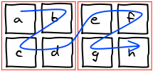
The previous method tried to change the past. One knows that changing the past also changes the future πŸ™‚ Instead, what we want to do is to fix the present and let time go on. We are going to insert b to the temporary block, layout that block and insert g (that was previously in the temporary block) right after in the list. This way, we get the layout we wanted.

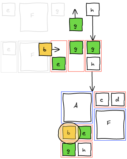
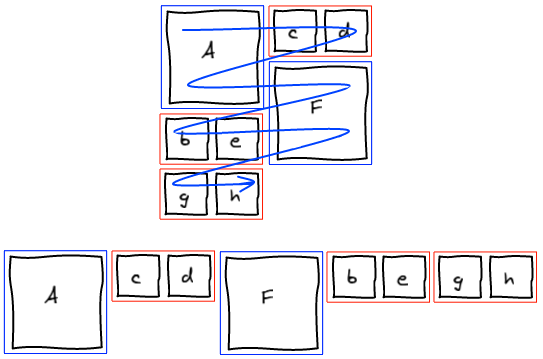
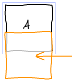
At this point, we completely blew up the sequence that lead to this layout. Instead of trying hard to move elements around to get a valid sequence, we're going to be smarter. We managed to get the layout we wanted. Well, let's just read that layout and build a valid sequence out of it. I call this a canonical sequence.

Handle all the cases!

Now that we have the general framework, we need to see how to "fix the present" in all the different cases.
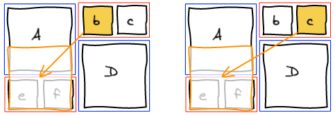
Small -> Small

As seen in the example, we insert the small element at the right position in the block and move the last element of the block back into the list of elements to be processed.

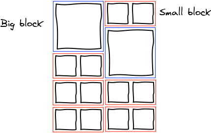
Big -> Small | Big -> Top of Big

Those two cases are also really easy. We layout the big element we are trying to insert and then layout the block without any modification.
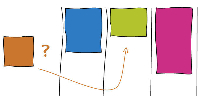
Small -> Top of Big

This one is more tricky. We want to find another small image so that we've got two to form a small block.

  • If at this point, there's a temporary small block that is not empty, then perfect, we add the small image we want to insert at the end of the block and layout it.
  • If not, we're going to look for the first small image in the list of elements left to be processed. With this image, we're going to form a small block and layout it. Note: if there are many big images, the small image can be pulled from quite a long distance.
  • If there's no small image left, we're going to layout a small block with only the image we want to insert. We'll discuss why it is okay later.

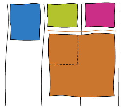
Small -> Bottom of Big | Big -> Bottom of Big


And now comes the hard part. First, you've got to be warned, there isn't always a solution for this problem. For example, whatever ordering you chose, you are never going to be able to move D at the bottom of A.

Let's take an example where it is actually possible. We want to move D at the bottom of A.

We start the algorithm and run into the conflicting situation on the first element.

The idea here is to pull small elements from the rest of the list in order to make a small block at this position. Once it is done, the other column is going to be filled with the big block that was conflicting and we're back to the column we were initially. Only this time, we are one row lower. And this makes a big difference. Whatever we are about to layout here is either a small block or the top of a big block. We already know how to handle those two cases.

If there isn't enough small elements remaining in the stream to form a small block, we're not able to find a solution. There may be a solution if we allow to update the past, but as we've seen earlier, this is a tricky business.

We cannot just stop here and raise an error: no solution found. Instead, a trade-off we can make is to put the element we are trying to insert at the top of the big block instead of the bottom. This is obviously not perfect but is the best user experience I was able to find.

Last small element

The last issue we're going to cover in this article is how to handle the last small element. Imagine we're in the situation where there are 2 images, one big and one small. You are trying to move the small element before the big one.

With the algorithm I explained, you are never going to be able to handle this case. There are only two possible ordering: Ab and bA. But both put the big image first and the small image second.

Priority on small blocks

The main issue here is that the big block has the priority over the small one. You can change the algorithm such that as soon as you see a small element, you pull the next small one from the list to make a block. This fixes the issue here but introduces a side effect when making photos bigger.

In a canonical stream, when you make an image bigger, you've got a nice property that it always expand in the same column and to the bottom.

When you change the priority, the other small image of the block is going to take precedence. Therefore the (now bigger) image is going to move to the other column. This is not a good user experience.

We could reorder the stream and move the image at the right position using the algorithms we've seen previously. However, not all the streams are reorderable. In Facebook case, only the photos in an album are reorderable. All the other streams are sorted by time, so reordering is not acceptable.

Priority on small blocks with only one image

The solution is to change the priority but only for a special case: when there are no more small images left to make a full small block. We still maintain all the benefits of having small blocks having a lower priority than big blocks, but at the same time fix the issue with the last lonely small block.

Bigger Images and Ordering

When making images bigger, we change the order of the stream as seen previously. For example, let's make b bigger in the following example.

So far so good, B expanded in its column and below. Now we are going to make a bigger.

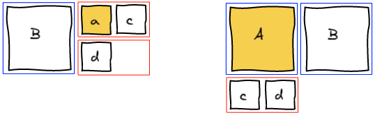
And ... it's unexpected ... A and B just swapped behind our eyes for no apparent reason. You have to understand the algorithm to figure out what is going on. a when small was put after B because it didn't have the precedence. But, when you make A big, it gets back its precedence.

Canonicalize

A solution is to canonicalize the stream every time you highlight an image. This fixes the issue we described but introduces another one. Making a photo bigger is intuitively an operation that is reversible. When we make an image bigger and right after make it smaller, we expect that we get back to the original position. If you canonicalize after making it bigger, this property no longer holds true.

In the following example, a and b get inverted after making b bigger then smaller.

Since we cannot reorder images in the stream in Facebook, we did not try to find a better solution. We just stay with the unexpected behavior.

Conclusion

Check out the Demo! (Note: this is an earlier version, the most obscure tricks are not handled the same way and don't work all the time)

The transition from a static layout algorithm to a dynamic one was not an easy task. But in the end, we've been able to figure out all the edge cases and have a solution for each of them.

The issues arise when there are many big images and not enough small ones to do the various balancing operations. Hopefully the user are going to be moderate and don't make all the images of their stream big πŸ™‚

Layout Algorithms: Facebook | Google Plus | Lightbox | Lightbox Android | 500px

For the redesign of the Photo Section of Facebook we wanted to highlight some photos by making them bigger. It all started with the following mock by Andy Chung:

Layout

Alternated Blocks

My first shot at the problem was to make a fixed layout where we would alternate big images on the left and on the right.

With this scheme, you have one big image every 9. We started brainstorming about putting the one with the most number of likes and comments there. However, this felt to be very arbitrary.

Emily Grewal, the Product Manager of the project wanted something better: being able to make any (and all) image bigger. Automatic selection of images to be bigger was also discarded as we wanted the user to feel in control of this space.

Big and Small Blocks

In the next iteration, I tried to give more control by reducing the size of the blocks. Now it is either one big image or 4 small ones.

One constraint we had at the time was that the columns could start at an arbitrary height. With this layout, we can make the block display: inline-block; and the browser is going to reorder them automatically as the columns initial height are changing.

However, this wasn't all shiny. One nasty side effect is the fact that the ordering of two small blocks next to each other is awkward. Instead of being from left to right they are in zig-zag. You could linearize those but you would lose the layout from CSS.

Smaller Small Blocks

The next (and final) idea is to shrink the small blocks from 4 to 2 elements. It solves our zig-zag issue and feels more natural.

Algorithm

The idea behind the algorithm is to have temporary blocks that serve as buffer. We iterate over all the input elements and put them into the temporary block of the corresponding size. Once a temporary block is full, we add it into the grid in the smallest column.

Here's an example where we try to layout AbcdEf:

And there's the pseudo-code implementation of the algorithm:

function layout(elements) {
  var columns = [new Column(/*height */ 0), new Column(/*height */ 0)];
  var stash = [];
 
  elements.forEach(function (element) {
    if (element.isBig()) {
      var column = columns.getSmallestColumn();
      column.renderBigBlock(element);
      column.height += 2;
 
    } else /* element.isSmall() */ {
      stash.push(element);
      if (stash.length === 2) {
        var column = columns.getSmallestColumn();
        column.renderSmallBlock(stash[0], stash[1]);
        column.height += 1;
        stash = [];
      }
    }
  });
 
  if (stash.length > 0) {
    var column = columns.getSmallestColumn();
    column.renderSmallBlock(stash[0], stash[1] /* can be undefined */);
    column.height += 1;
  }
}

Conclusion

Check out the Demo!

This is the layout algorithm we ended up using for Facebook photos. We found a way to let the user make all the images he wants bigger minimizing the risk of the result being ugly.

Pros:

  • Can make any/all image bigger
  • No holes
  • Order is mostly respected
  • Need to store only two sizes per image

Cons:

  • All images have the same dimension
  • Cropping required to display both landscape and portrait images
  • Only works for a number of column that is a multiple of 2

If you want to know how reordering works, read the follow-up article πŸ˜‰

grab and grabbing are two great CSS cursors you can use when you are moving things around.

Windows: Mac:

Since those are not standard, it is really tricky to get them working cross browser. This article is going to show you all the available workarounds to get the best version working everywhere.

Browsers

Firefox

The grab icons were first introduced in Firefox 1.5 (November 29, 2005).

.grab { cursor: -moz-grab; }
.grabbing { cursor: -moz-grabbing; }

Chrome & Safari on Mac & Linux

The cursor were then introduced on Webkit in March 2008 but only for Mac. The cursors are also working on Linux.

.grab { cursor: -webkit-grab; }
.grabbing { cursor: -webkit-grabbing; }

Chrome Windows

However, the icons don't work on Windows. This is even more vicious as the CSS rule is being parsed and accepted, but it doesn't change the cursor. Therefore you cannot do something like this:

.grab {
  cursor: move;
  cursor: -webkit-grab; /* NOT WORKING */
}

You have to do two distinct rules, one for Windows and one for Mac & Linux.

There is a way to get the cursor working using a custom cursor. Fortunately for us, Google already did the asset in Gmail and Google Maps.

.grab { cursor: url(https://mail.google.com/mail/images/2/openhand.cur) 8 8, move; }
.grabbing { cursor: url(https://mail.google.com/mail/images/2/closedhand.cur) 8 8, move; }

Internet Explorer 7, 8, 9

Now, as usual, Internet Explorer doesn't support everything. You cannot specify the relative position of the cursor. This is not the end of the world, we can just ignore it and the cursor will be slightly misaligned. Since the cursor isn't a pointer, this is not an issue in practice.

.grab { cursor: url(https://mail.google.com/mail/images/2/openhand.cur), move; }
.grabbing { cursor: url(https://mail.google.com/mail/images/2/closedhand.cur), move; }

I did not test IE6 nor IE10. If you know something about those please leave a comment πŸ™‚

Opera

Opera doesn't have any support for custom cursors. So we can use the move cursor that is less than ideal but gives the idea of movement.

.grab, .grabbing { cursor: move; }

Conclusion

I made this jsFiddle to test all the different ways to show cursors. You can play with it to handle browsers I did not list here.

There is a viable solution for all the major browsers except Opera. Sadly, I couldn't find a way to do feature detection in order to see which version to use in which case. Also, because of the Webkit issue on Windows, you cannot make a simple sequence of rules and let the browser ignores the ones he doesn't know. You have to get a browser sniffing library and include the appropriate rule for the browser.

Some related articles that helped me come to the solution. Note that no one is successfully managing to get it working on all the browsers.

Layout Algorithms: Facebook | Google Plus | Lightbox | Lightbox Android | 500px

Google Plus has a really nice image gallery. They somehow managed to display all the photos without cropping, without reordering and without any holes. We are going to see how they did it in this blog post.

How does it work?

Here we have three images with various sizes and aspect ratio and we want to display them in the page. The layout algorithm is the consequence of one clever trick: all the images of the same row are have the same height.

So the only unknown is H, the height of the row given the three images we want to show. Using some basic math, we can solve the problem!

So now we know how to calculate H, the height of all the images. Since we want to keep aspect ratio, we can also calculate their width. As you can see, it is trivial to generalize the operation to n images.

How many images?

Now the tricky part is to decide how many images we want to put in the row. I came up with a solution that gives similar results to Google Plus but I'm not 100% sure that's how they do it.

One fact you can observe is the fact that few images leads to a huge row while many images lead to a small row.

So the idea is to try adding one image at a time and have a threshold for the maximum height we want. Once the row is smaller than this threshold, we render it!

Conclusion

Check this other article to find where best to place the breaks.
Check out the Demo! Here's a little Pro/Con to know if this technique will fit your needs.

Pros:

  • No cropping
  • No reordering
  • No holes
  • Arbitrary Width

Cons:

  • Portrait images are much smaller than landscape ones
  • All the rows do not have the same height
  • The view feels a bit chaotic with no clear structure
  • Requires dynamic resize of images

Some other implementations I found on the internet:

Layout Algorithms: Facebook | Google Plus | Lightbox | Lightbox Android | 500px

Lightbox.com has a really interesting image layout algorithm. We're going to see how it works and its best use case.

How does it work?

Column based

The algorithm is column based. You pick a number of columns at the beginning. Then every time you want to layout an image, you just place it to the smallest column.

Some facts about this layout: All the images here have the same width. The order is not particularly respected. The end of the stream is not properly aligned.

Bigger Images

The interesting part of Lightbox layout is the ability to make some images bigger. When you are about to layout an image, you look at the height of the neighbor columns. If the column has the same size, then you can to extend the image to take the width of both columns.

Beating the Odds

Having two adjacent columns with the exact same size is rarely going to happen in practice. In order to solve this situation we are going to cheat a little. We draw an invisible grid and every time an image doesn't perfectly align with the grid, we crop it to the nearest line.

The bigger the grid is, the more opportunity you will have to make bigger images but at the same time, the more you will crop your images.

When to make images bigger?

This might be counter intuitive but you don't want to make images bigger every time the opportunity present itself. Every time you make an image bigger, it is going to preserve two adjacent columns of the same height. If you keep adding bigger images on top of those two column, you essentially created a column that has twice the width.

Using a column based layout implies that landscape images are much smaller than the portrait ones. In order to restore balance, Lightbox uses the following heuristic. If the image is landscape, then it has 60% chance to be made bigger, only 10% when it is a portrait.

Conclusion

Check out the Demo!

This layout is very good for random collection of images in an infinite stream. Here's a little Pro/Con to know if this technique will fit your needs.

Pros:

  • Can make some images bigger
  • No holes
  • Need to store only two dimensions per image
  • Arbitrary number of columns

Cons:

  • Landscape images are much smaller than portrait ones
  • Images that can be bigger is very arbitrary
  • Small cropping
  • Order is not respected
  • End of stream is not well aligned

Some other implementations I found on the internet: