I was reading about text layout algorithms when I found a striking parallel with Google Plus image layout algorithm. This blog article explains how to find the best line breaks for the image layout.

Line Breaking Algorithm

"Breaking Paragraphs into Lines" article written in 1980 by Donald Knuth and Michael Plass explain how to find the best line breaks in order to make justified text look pretty. The goal is to find where to put line breaks on this paragraph:

In olden times when wishing still helped one, there lived a king
whose daughters were all beautiful; and the youngest was so
beautiful that the sun itself, which has seen so much, was aston-
ished whenever it shone in her face. Close by the king’s castle lay
a great dark forest, and under an old lime-tree in the forest was
a well, and when the day was very warm, the king’s child went
out into the forest and sat down by the side of the cool fountain;
and when she was bored she took a golden ball, and threw it up
on high and caught it; and this ball was her favorite plaything.

The first thing to notice is that you cannot break everywhere. In bold, are all the words that can be end of lines while maintaining the constraint of reasonably stretching white spaces in the line.

The first line only has two allowed words while the line before last line has seven. However, the seven are not allowed at the same time, each of them depend on the previous breaks configuration. You can draw a graph that shows all the possible breaks configurations.

graph-knuth

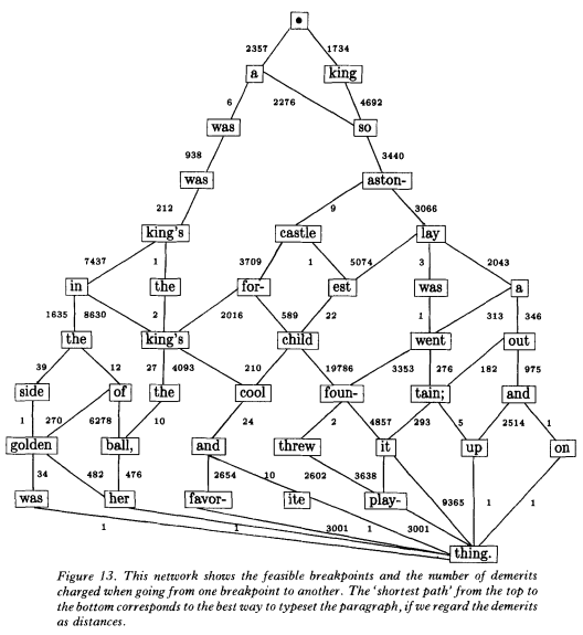
Each transition in this graph represents a line of text (between two breaks). If you can give a fitness value to each line, then you can apply a shortest path algorithm on the graph to find the best breaks configuration. The rest of the article studies a flexible fitness framework that covers all major text layout constraints, but that will not be of any help for our problem.

Parallel with Image Layout

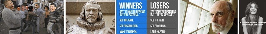
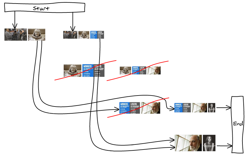
Let's say we want to layout the following five images:

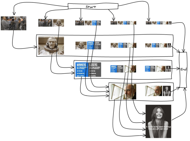
There are many ways to split the images into lines. Here is an exhaustive list of the lines we can have for our five images:

 1
 12      2
 123     23     3
 1234    234    34    4
 12345   2345   345   45

And, we need to link the lines such that they form 12345 at the end. For example 1-2-3-4-5, 12345, 123-4-5 ... I've drawn the full graph so you get an idea of what it looks like:

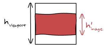
Like in the line breaking algorithm for text, not all the break positions are wanted. Having only one image would make it way too big, having more than three would make them too small. So we're going to remove them from the graph.

By disallowing some lines, some nodes are now unreachable, trimming down the graph as well. In our example, we are left with only two valid layouts: 123-45 and 12-345.

possible

Cost Metrics

I found it very hard to visually evaluate two layouts. Most of the time, you can easily spot extreme things you don't want such as a giant image or too many small ones. Then, the goal of the cost metric is to minimize the number of those occurrences.

Max height

The first approach tries to respect the constraints of the first-fit heuristic: as soon as the height goes below a threshold, we display the images. We therefore have a MAX_HEIGHT constant that no line can go above.

Because the graph is acyclic, we can use Dijkstra shortest path algorithm to find the longest path (Proof), we just have to return negative costs.

function cost(images, i, j) {
  var height = compute_height(images, i, j);
  if (height > MAX_HEIGHT) { return null; }
 
  // Maximize the number of breaks
  return -1;
  // Maximize the total height
  return -height;
  // Maximize the average image height
  return -(height * (j - i));
}

Target Height

The other approach is to have a target height per line and try to have all the lines as close as possible to the target. The function should return 0 when the line is exactly the size of the target line.

We can write several versions that are going to weight errors differently. You can have a greater variance with a more precise mean, or the opposite. You can prefer being a bit bigger than smaller ...

function cost(images, i, j) {
  var height = compute_height(images, i, j);
 
  // Minimize the total height difference from the target
  return Math.abs(TARGET_HEIGHT - height);
 
  // Minimize the difference to the target and
  // penalize more harshly big differences
  return Math.pow(TARGET_HEIGHT - height, 2);
 
  // Minimize the difference area from the target
  var diff = 0;
  for (; i < = j; ++i) {
    var ratio = images[i].width / images[i].height;
    var target_area = TARGET_HEIGHT * TARGET_HEIGHT * ratio;
    var area = height * height * ratio;
 
    diff += Math.abs(target_area - area);
  }
  return diff;
}

Conclusion

Check-out the first-fit demo versus best break demo (using cost = (target_height - height)^2)

Thanks to an unrelated reading, I've been able to draw a parallel between text display and image layout. Who would have thought that graph theory would be involved there too 🙂

We can now find the best layout at a cheap cost (nearly-linear with the number of images if you only allow a small number of possible breaks per line). The cost metric allow you to easily disallow patterns you find bad looking.

In this talk I give an overview of the big categories of image layout algorithms with examples for each of them and present criterias to look at when evaluating them.

Pete Hunt just showed me a cool trick today. When implementing an image gallery, chances are that you are going to let the user click on the image and based on the position, it will either display the next image or previous.

The way you would implement it without too much thought is to let the left part be for the previous action and the right part be for the next action as in the following drawing.

However, usually when you are viewing an image, you want to see the next, not the previous one. You also tend to just want to click anywhere on the image to make it go next. The previous action is not the default use case and is something you actively think about doing.

Instead of being 50%/50%, you can make the next action area bigger. Here is an example with 20%/80%.

In practice it works very well and is more user friendly that the naive one.

In a previous article I explained how CSS Percentage Background Position was working. This time I'm going to talk about the two ways to resize an image to a viewport: contain and cover. This is such a fundamental operation that I explained all the formulas and where they come from. They are the base for anything more complicated you want to do with images.

Definitions

We are going to manipulate two rectangles in this article: the image we want to display and the viewport in which we want to display it. Each rectangle has three properties: a width \(w\), a height \(h\) and an aspect ratio \(r\).

image-viewport

The aspect ratio of an image is defined by the following formula: \[r_{atio} = \frac{w_{idth}}{h_{eight}}\]

While there are an infinite amount of aspect ratios, we are going to be in contact with for major categories of aspect ratio when displaying photos on the internet.

ratios

Adapting the Image to the Viewport

Stretch the image

The naive way to adapt an image to a viewport is to set both the width and height of the image to match the viewport width and height.

stretch

However, doing that is going to stretch your image and make it look very bad.

car_resize car_resize car_resize

The problem with the previous scaling is that we didn't respect one fundamental rule: the aspect ratio must remain constant after the transformation.

\[r_{image} = r'_{image}\]

Contain

So, in order to make our image fit the viewport, we can make the image being contained in the viewport and have padding. Think black bars when you are watching a movie.

contain

In term of equations, we are setting the width of the image to be the width of the viewport: \(w'_{image} = w_{viewport}\). Since you also have \(r_{image} = r'_{image}\), and \(r'_{image} = \frac{w'_{image}}{h'_{image}}\), it gets trivial to compute the remaining dimension.

\[
h'_{image} = \frac{w_{viewport}}{r_{image}}
\]

Cover

There is another possibility, you can also make the image cover the viewport.

cover

Despite being conceptually different, the formula is nearly the same. Instead of fitting the width, we now fit the height and can compute the width the same way:

\[w'_{image} = h_{viewport} * r_{image}\]

Aspect Ratios?

In our examples so far, we considered that the image was more horizontal than the viewport. What happens if we do the opposite: switch the image and the viewport dimensions. Check out the following image with all the new equations and unknowns.

Cover

Contain

contain_cover_rato

The similarities are striking. The formulas are exactly the same but inverted, cover is now using contain formula and vis versa. It makes it even easier to implement the algorithm, only two cases to handle.

Summary

Here is a summary of the formulas if you want to implement contain and cover.

Contain Cover
\(r_{image} \le r_{viewport}\) \(w'_{image} = h_{viewport} * r_{image}\)
\(h'_{image} = h_{viewport}\)
\(w'_{image} = w_{viewport}\)
\(h'_{image} = \frac{w_{viewport}}{r_{image}}\)
\(r_{image} \ge r_{viewport}\) \(w'_{image} = w_{viewport}\)
\(h'_{image} = \frac{w_{viewport}}{r_{image}}\)
\(w'_{image} = h_{viewport} * r_{image}\)
\(h'_{image} = h_{viewport}\)

Hidden Area

We either introduced black bars or hidden some part of the photo. It's interesting to see how much it accounts for. For example, if we only hide 2% of the image, then it may not be useful to run an algorithm to find the best cropping position.

hidden area

The method is making sure that one of the dimensions is equal in both the adapted image and viewport, in this case the width. So all we are left to do is to compute the small height divided by the big height.

\[hidden = \frac{area'_{image}}{area_{viewport}} = \frac{w'_{image} * h'_{image}}{w_{viewport} * h_{viewport}} = \frac{h'_{image}}{h_{viewport}}\]

We can repeat the process for the four other cases and come up with the following summary:

Contain Cover
\(r_{image} \le r_{viewport}\) \(hidden = \frac{w'_{image}}{w_{viewport}}\) \(hidden = \frac{h_{viewport}}{h'_{image}}\)
\(r_{image} \ge r_{viewport}\) \(hidden = \frac{h'_{image}}{h_{viewport}}\) \(hidden = \frac{w_{viewport}}{w'_{image}}\)

Note that in this case, we have to evaluate the four different possibilities. As this is a bit error prone and annoying to read all the cases, we can find another way to write it down. Let's see what happens if we compare the ratios.

\[\frac{r'_{image}}{r_{viewport}} = \frac{\frac{w'_{image}}{h'_{image}}}{\frac{w_{image}}{h_{viewport}}} = \frac{w'_{image}}{h'_{image}} \frac{h_{image}}{w_{viewport}} = \frac{w'_{image}}{w_{viewport}} \frac{h_{image}}{h'_{image}}\]

We know that either the widths or the heights are equal. So it manages to find the proper two terms and the fraction. Now, nothing guarantees that they are in the good position. So we have either the result or \(\frac{1}{result}\). As we know we want a number smaller than 1, we can just take the minimum of both.

\[hidden = min\left(\frac{r_{image}}{r_{viewport}}, \frac{r_{viewport}}{r_{image}}\right)\]

Note: We were able to transform \(r'_{image}\) in to \(r_{image}\) because they are equal.

No Upscale

If you look closely at the formulas, we never actually use the width and height of the original image, we only use its aspect ratio. Therefore, if the original image is too small, it will be upscaled and appear very pixelated.

The easiest way to fix it is to compute the intended width and height, and make sure it is not bigger than the original width and height

\[w'_{image} \leftarrow min(w'_{image}, w_{image})\]\[h'_{image} \leftarrow min(h'_{image}, h_{image})\]

And here is the result:

Conclusion

I wrote this article mainly in order to have a reference of all the formulas I wrote in the code and where they came from. All the formulas are really simple (I know, they look really scared in a computer screen unfortunately) and any time you want to display an image you have to play with their width, height and area. So it's good to actually practice using them.

One key learning from this blog article should be that the aspect ratio is the most important thing that defines an image. Width and height are not actually that important as you are going to scale your image all the time. If you uses aspect ratio everywhere instead of width and height, your code is going to be a lot less error prone as we are already dealing with 2 other groups of width and heights: the scaled image and viewport size.


When displaying images naively, you may end up losing image quality because of a relatively unknown phenomena. If you happen to display an image with a dimension that is one pixel off the real image dimension, the resizing operation (which is costly in the browser) is going to be the equivalent of a blur. See the following example:

130x130 129x129

When you look at it from an external perspective, it seems to be very intentional to display and image with a dimension that is one pixel off. However it can happen for many reasons, some are bugs and some are legitimate.

Grid Sizes

Let's say the content area where you want to display a 4-columns image grid has a width of 500 pixels. And you want to have the same padding in the edges as in-between the images.

\[4 * image{ }width + 5 * padding = 500\]\[image{ }width = \frac{(500 - 5 * padding)}{4}\]

The only padding value between 2px and 8px that give an integer number for the image width are 4px and 8px. But unfortunately, none of them look good, you really want 6px padding.

120x120 and 4px padding.

115x115 and 8px padding.

In this case, you want to cheat and don't have all the same width and padding but make some of them 1 pixel smaller.

You can for example say that edges will have 5 pixel and inside 6 pixels. However this is a bad idea because it is going to be visually visible. By changing from 5 to 6 you are doing a variation of 17%.

\[5 + 118 + 6 + 118 + 6 + 118 + 6 + 118 + 5 = 500\]


118x118 and 5px padding on the sides, 6px padding in-between.

Instead you want to borrow a pixel from the images. Having two with 127px width and two with 128px width. The difference is not visible by the eye.

\[6 + 117 + 6 + 118 + 6 + 117 + 6 + 118 + 6 = 500\]


117x118 and 118x118 alternated and 6px padding.

So now we are in a situation where we want to display an image with 1 less pixel. In order to do that without bluring the image, the trick is to use a container with the size you want to display with overflow: hidden; and inside the properly sized image.

<div style="overflow: hidden; width: 129px; height: 129px;">
  <img src="130x130.png" width="130" height="130" />
</div>
130x130 129x129

Chrome bug

Being one pixel off is really easy, the main cause is different rounding. One one part of the code you use round() and in another part you use floor(). If the number is decimal, you have half chances to get a wrong result. For example, there is currently a bug in Chrome where hardware accelerated rendering has similar issue.

In order to get good scrolling performance, we enable hardware acceleration using transform: translateZ(0); on all the visible images on the viewport. However, when we mouse over an image, we display some overlay and therefore decide to remove hardware acceleration for it to avoid thrashing GPU memory.

To display images, we use a container as described above with the CSS property left: -7.92%; to position the image properly in the viewport. The result is that the image is moving around when you mouse hover it on Chrome. There is probably a different rounding applied between the CPU and the GPU code. The net effect is the image being resized by one pixel and blurry by default. When you mouse over, the image has the correct size.

In order to fix the issue, we can use integer number in pixel left: -24px; instead. This way the browser doesn't have to round anything.

This is only one of the many similar issues with the browsers handling rounding differently. People implementing fluid layout suffer a lot because of browser inconsistencies. If this is happening in browser implementations, there is also a high probability that this issue is going to appear in your own code if you didn't make sure it was rounding as expected.

Conclusion

This problem is very common and comes from many different sources, but always because of the same root cause: rounding issues. Since sub-pixel rendering is not widely implemented, it is not going to disappear. I hope that you are now aware of it and will address it to avoid affecting image quality of your thumbnails 🙂