Google Plus has a really nice image gallery. They somehow managed to display all the photos without cropping, without reordering and without any holes. We are going to see how they did it in this blog post.
How does it work?

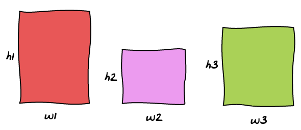
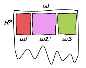
Here we have three images with various sizes and aspect ratio and we want to display them in the page. The layout algorithm is the consequence of one clever trick: all the images of the same row are have the same height.

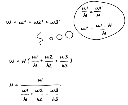
So the only unknown is H, the height of the row given the three images we want to show. Using some basic math, we can solve the problem!

So now we know how to calculate H, the height of all the images. Since we want to keep aspect ratio, we can also calculate their width. As you can see, it is trivial to generalize the operation to n images.
How many images?
Now the tricky part is to decide how many images we want to put in the row. I came up with a solution that gives similar results to Google Plus but I'm not 100% sure that's how they do it.
One fact you can observe is the fact that few images leads to a huge row while many images lead to a small row.

So the idea is to try adding one image at a time and have a threshold for the maximum height we want. Once the row is smaller than this threshold, we render it!
Conclusion
Check this other article to find where best to place the breaks.
Check out the Demo! Here's a little Pro/Con to know if this technique will fit your needs.
Pros:
- No cropping
- No reordering
- No holes
- Arbitrary Width
Cons:
- Portrait images are much smaller than landscape ones
- All the rows do not have the same height
- The view feels a bit chaotic with no clear structure
- Requires dynamic resize of images
Some other implementations I found on the internet:
- Flickr Explore tab
- Flickr ‘Justified’ Layout in JQuery
- Florian Maul: All rows are the same height, cropping to fit.
- Moeishaa: Every time the same number of images per row.
- SlabType: A layout algorithm for headlines that uses a similar approach.

