I was reading about text layout algorithms when I found a striking parallel with Google Plus image layout algorithm. This blog article explains how to find the best line breaks for the image layout.
Line Breaking Algorithm
"Breaking Paragraphs into Lines" article written in 1980 by Donald Knuth and Michael Plass explain how to find the best line breaks in order to make justified text look pretty. The goal is to find where to put line breaks on this paragraph:
In olden times when wishing still helped one, there lived a king
whose daughters were all beautiful; and the youngest was so
beautiful that the sun itself, which has seen so much, was aston-
ished whenever it shone in her face. Close by the king’s castle lay
a great dark forest, and under an old lime-tree in the forest was
a well, and when the day was very warm, the king’s child went
out into the forest and sat down by the side of the cool fountain;
and when she was bored she took a golden ball, and threw it up
on high and caught it; and this ball was her favorite plaything.
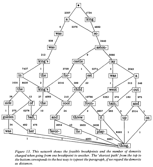
The first thing to notice is that you cannot break everywhere. In bold, are all the words that can be end of lines while maintaining the constraint of reasonably stretching white spaces in the line.
The first line only has two allowed words while the line before last line has seven. However, the seven are not allowed at the same time, each of them depend on the previous breaks configuration. You can draw a graph that shows all the possible breaks configurations.

Each transition in this graph represents a line of text (between two breaks). If you can give a fitness value to each line, then you can apply a shortest path algorithm on the graph to find the best breaks configuration. The rest of the article studies a flexible fitness framework that covers all major text layout constraints, but that will not be of any help for our problem.
Parallel with Image Layout
Let's say we want to layout the following five images:

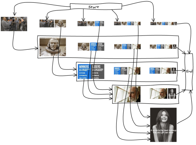
There are many ways to split the images into lines. Here is an exhaustive list of the lines we can have for our five images:
1 12 2 123 23 3 1234 234 34 4 12345 2345 345 45 |
And, we need to link the lines such that they form 12345 at the end. For example 1-2-3-4-5, 12345, 123-4-5 ... I've drawn the full graph so you get an idea of what it looks like:

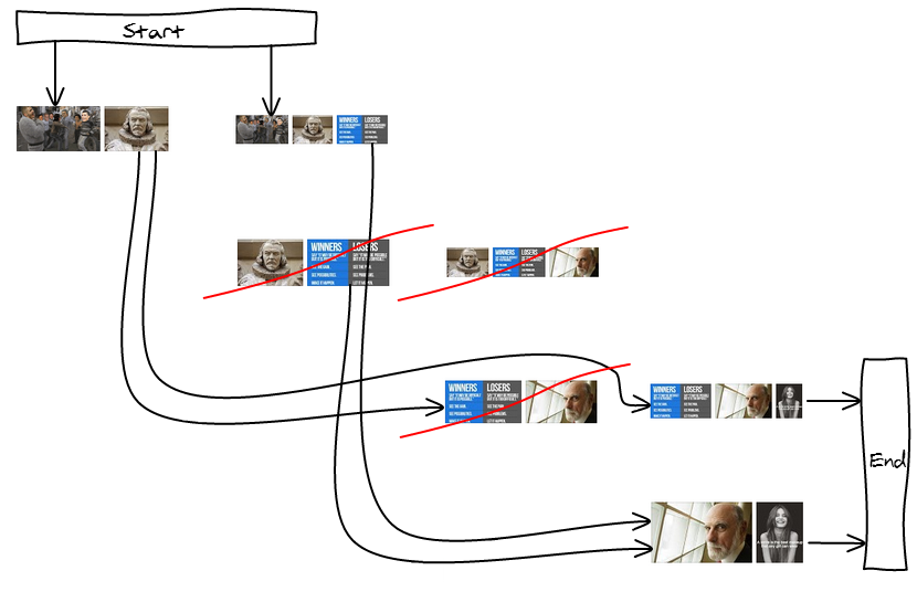
Like in the line breaking algorithm for text, not all the break positions are wanted. Having only one image would make it way too big, having more than three would make them too small. So we're going to remove them from the graph.

By disallowing some lines, some nodes are now unreachable, trimming down the graph as well. In our example, we are left with only two valid layouts: 123-45 and 12-345.

Cost Metrics
I found it very hard to visually evaluate two layouts. Most of the time, you can easily spot extreme things you don't want such as a giant image or too many small ones. Then, the goal of the cost metric is to minimize the number of those occurrences.
Max height
The first approach tries to respect the constraints of the first-fit heuristic: as soon as the height goes below a threshold, we display the images. We therefore have a MAX_HEIGHT constant that no line can go above.
Because the graph is acyclic, we can use Dijkstra shortest path algorithm to find the longest path (Proof), we just have to return negative costs.
function cost(images, i, j) { var height = compute_height(images, i, j); if (height > MAX_HEIGHT) { return null; } // Maximize the number of breaks return -1; // Maximize the total height return -height; // Maximize the average image height return -(height * (j - i)); } |
Target Height
The other approach is to have a target height per line and try to have all the lines as close as possible to the target. The function should return 0 when the line is exactly the size of the target line.
We can write several versions that are going to weight errors differently. You can have a greater variance with a more precise mean, or the opposite. You can prefer being a bit bigger than smaller ...
function cost(images, i, j) { var height = compute_height(images, i, j); // Minimize the total height difference from the target return Math.abs(TARGET_HEIGHT - height); // Minimize the difference to the target and // penalize more harshly big differences return Math.pow(TARGET_HEIGHT - height, 2); // Minimize the difference area from the target var diff = 0; for (; i < = j; ++i) { var ratio = images[i].width / images[i].height; var target_area = TARGET_HEIGHT * TARGET_HEIGHT * ratio; var area = height * height * ratio; diff += Math.abs(target_area - area); } return diff; } |
Conclusion
Check-out the first-fit demo versus best break demo (using cost = (target_height - height)^2)
Thanks to an unrelated reading, I've been able to draw a parallel between text display and image layout. Who would have thought that graph theory would be involved there too 🙂
We can now find the best layout at a cheap cost (nearly-linear with the number of images if you only allow a small number of possible breaks per line). The cost metric allow you to easily disallow patterns you find bad looking.
