CSS – Displaying a Justified Line of Text

Now that I am working everyday with an awesome designer, I’m starting to discover the designer side of things. I got introduced to typography and realized how bad support for good typography was in the browsers. The tale to implement proper text layout algorithms started.

Line breaking and Hyphenation

I first read two fundamental papers on the algorithms that power TeX. The first one, written by Franklin Mark Liang, explains how to properly hyphenate words. When reading it in 2012, it is a bit unreal all the care taken to reduce memory as 20KB was a hard limit for the project. The second is written by Donald Knuth and Michael Plass and talks about finding when to break lines. It gives a very good introduction of all the subtleties behind the seemingly easy line breaking operation.

I was about to implement the papers when I realized that Bram Stein already wrote a Javascript version. Hypher to hyphenate and TypeSet for line breaking.

Displaying a line

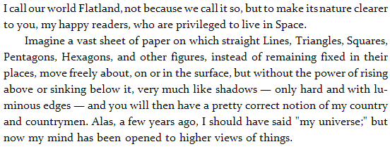
In all our examples, we are going to try and display the first two paragraphs of the novel Flatland by Edwin Abbott. I’ve seen this being used by two designers interested in typography so I guess I’m going to use it too!
Absolute Position Everything

The text algorithms give us for each character, its position in the paragraph. The first idea that comes to mind is to create one span for each element and absolutely position it in the DOM.

<span style="left: 0px; top: 23.2px;">I</span>
<span style="left: 5px; top: 23.2px;">&nbsp;</span>
<span style="left: 7.529411764705882px; top: 23.2px;">c</span>
<span style="left: 14.529411764705882px; top: 23.2px;">a</span>
<span style="left: 22.529411764705884px; top: 23.2px;">l</span>
<span style="left: 27.529411764705884px; top: 23.2px;">l</span>
<!-- ... -->

First thing to notice is the presence of &nbsp; instead of a white space. In HTML, white spaces around tags are generally omitted. This is useful as you can properly indent your HTML code and it will not add many unwanted white spaces in the result. It can also be annoying when you want to layout things with display: inline-block; but that is another problem. In this case, we use &nbsp; to force a real white space.

Then, we can see that position have decimal precision. Nowadays, browser implement sub-pixel rendering and we can use it to evenly space words in a line. This makes less abrupt spacing changes.

The first downside of this technique is the weight of the generated output. Having one DOM element per letter is highly inefficient, especially on mobile devices.

The second is about text selection. It varies widely between browser but usually double click to select a word is not working. The highlight is not contiguous, there are unwanted white spaces around letters/words. For some reason, when you use shift+right, you have to go two times right to highlight the next letter. And finally, when copy and pasting, n are not taken into account.

White Space Flexbox

The second approach is to display the text line by line and use real textNode for words instead of a DOM element for each character. The issue we are going to face from now on is to make sure spaces have proper width such that the line is justified.

The first technique I am going to present has been found by Kevin Lynagh. We are going to use flexbox to stretch the spaces such that they fill the available space.

<div class="line">
  I<span class="glue"> </span>
  call<span class="glue"> </span>
  our<span class="glue"> </span>
  world<span class="glue"> </span>
  Flatland,<span class="glue"> </span>
  not<span class="glue"> </span>
  <!-- ... -->
  clearer
</div>
.line {
  display: box;
  box-pack: justify;
  box-orient: horizontal;
}
 
.glue {
  flex: 1;
  display: block;
}

.glue {
flex: 1;
display: block;
}

The visual display is perfect as it properly set the width of the glue elements with sub-pixel precision. However, copy and paste is not working as intended. All the spaces are being replaced by n as glue elements are display: block;. Browser support of Flexbox is still early so this technique cannot be used on popular websites.

If you want to render links, this approach is going to be problematic when they span over two lines. You are going to have to break the tag into two. This means that people clicking on the first part will not see the second highlight. If you had any Javascript listeners, you are going to have to duplicate them … It is making things more complicated.

One-line Justify

We really want the browser to do the justification part, but by default, it will not justify only one line of text. The reason is that the last line of any paragraph is not going to be justified. Using a trick I explained in a previous blog article, we can force it to do so.

<div class="justify">
  I call our world Flatland, not because we call it so, but to make its nature clearer
</div>
<div>
  to you, my happy readers, who are privileged to live in Space.
</div>
.justify {
  text-align: justify;
  word-spacing: -10px;
}
 
.justify:after {
  content: "";
  display: inline-block;
  width: 100%;
}

.justify:after {
content: "";
display: inline-block;
width: 100%;
}

The browser will not stretch the white space below the width of a white space. It will consider that there isn’t enough room and put the last character on the next line and then justify. In order to force it to do so, we want to remove some pixels from spaces. We can do that using word-spacing: -10px;. You’ve got to make this value at least equal to the width of a white space not to worry about it anymore. Note: don’t make it too important (like -99999px) as if the computed line width is negative, the browser will not attempt to justify the text.

This technique is working on all the major browsers (IE>7) and very light in term of DOM overhead. The copy and pasted text is not perfect as there will be n at every end of line (80-columns newsgroup style) but is good enough. We still have the tag issue as the previous technique.

Word-spacing

The previous techniques found ways to let the browser compute the proper white space widths. We made all the hard work of finding the best line-breaks, so we know the widths of the white spaces. Why don’t we tell it to the browser. For each line, we can update the word-spacing accordingly. This is the technique used by TypeSet.

<p>
<span style="word-spacing: -1.4705882352941178px;">
  I call our world Flatland, not because we call it so, but to make its nature clearer&nbsp;
</span>
to you, my happy readers, who are privileged to live in Space.
</p>

It is however to good to be true. Webkit has a bug where fractional pixel values are not supported with word-spacing, it has been reported in 2008 but not yet being worked on by anyone. So if you really want to work with Webkit, you have got to distribute the fractional values between words.

<p>
<span style="word-spacing: -2px;">
  I call our world Flatland,&nbsp;
</span>
<span style="word-spacing: -1px;">
  not because we call it so, but to make its nature clearer&nbsp;
</span>
to you, my happy readers, who are privileged to live in Space.
</p>

The downside now is that the first few letters look really close to each other and the remaining letters are farther away. Since all the modifications we do is adding spans around, text selection and copy and paste are completely unaffected. We still have the issue however.

White Space Custom Width

If word-spacing doesn’t work, we can instead set the width of each white space by hand. We are going to update margin-left with the amount we would have sent to word-spacing.

Unfortunately, if you combine textNodes and spans with &nbsp;, the white span will not appear. You have to wrap the textNode in a span. This makes the DOM more complicated than it should have been.

One last detail is that for some reason, the browser will not add any line break. Therefore you have to insert your own br tags.

<p>
<span>I</span><span style="margin-left: -1.4705882352941178px;">&nbsp;</span>
<span>call</span><span style="margin-left: -1.4705882352941178px;">&nbsp;</span>
<!-- ... -->
<span>nature</span><span style="margin-left: -1.4705882352941178px;">&nbsp;</span>
<span>clearer</span><span style="margin-left: -1.4705882352941178px;">&nbsp;</span>
<br />
to you, my happy readers, who are privileged to live in Space.
</p>

This technique doesn’t suffer from the problem. The text copy and pasted still have n at the end of each line. It enables sub-pixel text position in Chrome. The main downside is that it adds two new DOM elements per word.

Horizontally Scale the Line

In pdf.js, they write all the text into a canvas but display transparent text on-top in order to get browser selection. Instead of handling justification properly, they cheat and scale the text horizontally to fit the width.

<div style="transform: scale(0.9545764749570032, 1); transform-origin: 0% 0%;">
  These detailed metrics allow us to estimate parameters for a
</div>
<div style="transform: scale(0.9401883384450235, 1); transform-origin: 0% 0%;">
  simple model of tracing performance. These estimates should be
</div>

The trick works because the text is not being displayed. If you attempt to scale horizontally your text to fit the width of your page, you are going to see very bad scaling artifacts on your letters.

This technique is not quite what we want. It scales both letters and white spaces where we only want to scale white spaces. Therefore, the displayed text and the overlaid text do not always exactly match as seen in the image:
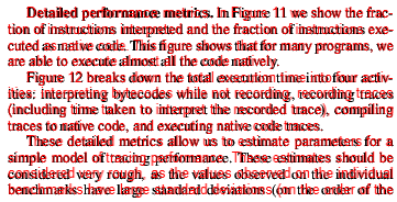
I’m not 100% sure what their constraints are but I’m hopeful that the one line justify trick would improve their text selection.

End of Line Padding

What we really want to do is to put a <br /> at the end of all the lines and let the browser justify for us. Unfortunately, this is not working, the browser doesn’t justify when there are <br />. Instead, we can exploit the fact that the browser uses a first-fit method to break the lines and force it to break where we want it to.

At the end of each line, we are going to add a empty span element that has the dimensions of the remaining space in the line. This way, the browser is going to see that the text and white space and our element make a full line, and then go to the next line.

Now, we really don’t want this element to appear, or it would just be the equivalent of a text-align: left;. Here is the trick, the margin-right property of the last element of the line is being ignored after the browser line-breaking algorithm.

<p style="text-align: justify;">
  I call our world Flatland, not because we call it so, but to make its nature clearer
  <span style="margin-right: 132px;"></span>
 
  to you, my happy readers, who are privileged to live in Space.
</p>

to you, my happy readers, who are privileged to live in Space.
</p>

It works like a charm when you don’t need to go below the default white-space size. If you do, then things get a little bit more complicated. We have to use word-spacing: -10px but then, the last line is going to be using this spacing instead of the default one.

The solution is to use our justify class from before that forces the last line to be justified and add an element at the end with the proper size to fill up the space. This time, we want the width of this element to remain after the line-breaking algorithm. So instead of doing a margin-right, we are just going to do margin-left.

<p class="justify">
  I call our world Flatland, not because we call it so, but to make its nature clearer
  <span style="margin-right: 132px;"></span>
 
  to you, my happy readers, who are privileged to live in Space.
  <span style="margin-left: 115px;"></span>
</p>

to you, my happy readers, who are privileged to live in Space.
<span style="margin-left: 115px;"></span>
</p>

This solution doesn’t suffer from the issue as we don’t wrap lines into an element. It doesn’t affect copy and paste as the end of line elements are empty and inline. It is also very lightweight as we only add one DOM element at the end of each line. And, it is cross-browser and supports sub-pixel word positioning.

Conclusion

By default, the browser doesn’t let you hint where you want it to break in a justified paragraph, we have to send carefully crafted inputs to exploit the way its internal rendering algorithm work. If you are to use one of the described techniques, use the last one as it solved all the pain points the others have.

You can test all of them using this JSFiddle Demo. Note: they have been hard-coded to work on Chrome Windows. If you are not using both, then it will likely be all screwed up because the font size is not the same and browser prefixes have not been added.

Beware of one pixel resizing

When displaying images naively, you may end up losing image quality because of a relatively unknown phenomena. If you happen to display an image with a dimension that is one pixel off the real image dimension, the resizing operation (which is costly in the browser) is going to be the equivalent of a blur. See the following example:

130×130 129×129

When you look at it from an external perspective, it seems to be very intentional to display and image with a dimension that is one pixel off. However it can happen for many reasons, some are bugs and some are legitimate.

Grid Sizes

Let’s say the content area where you want to display a 4-columns image grid has a width of 500 pixels. And you want to have the same padding in the edges as in-between the images.

[4 * image{ }width + 5 * padding = 500][image{ }width = frac{(500 – 5 * padding)}{4}]

The only padding value between 2px and 8px that give an integer number for the image width are 4px and 8px. But unfortunately, none of them look good, you really want 6px padding.

120×120 and 4px padding.

115×115 and 8px padding.

In this case, you want to cheat and don’t have all the same width and padding but make some of them 1 pixel smaller.

You can for example say that edges will have 5 pixel and inside 6 pixels. However this is a bad idea because it is going to be visually visible. By changing from 5 to 6 you are doing a variation of 17%.

[5 + 118 + 6 + 118 + 6 + 118 + 6 + 118 + 5 = 500]


118×118 and 5px padding on the sides, 6px padding in-between.

Instead you want to borrow a pixel from the images. Having two with 127px width and two with 128px width. The difference is not visible by the eye.

[6 + 117 + 6 + 118 + 6 + 117 + 6 + 118 + 6 = 500]


117×118 and 118×118 alternated and 6px padding.

So now we are in a situation where we want to display an image with 1 less pixel. In order to do that without bluring the image, the trick is to use a container with the size you want to display with overflow: hidden; and inside the properly sized image.

<div style="overflow: hidden; width: 129px; height: 129px;">
  <img src="130x130.png" width="130" height="130" />
</div>
130×130 129×129

Chrome bug

Being one pixel off is really easy, the main cause is different rounding. One one part of the code you use round() and in another part you use floor(). If the number is decimal, you have half chances to get a wrong result. For example, there is currently a bug in Chrome where hardware accelerated rendering has similar issue.

In order to get good scrolling performance, we enable hardware acceleration using transform: translateZ(0); on all the visible images on the viewport. However, when we mouse over an image, we display some overlay and therefore decide to remove hardware acceleration for it to avoid thrashing GPU memory.

To display images, we use a container as described above with the CSS property left: -7.92%; to position the image properly in the viewport. The result is that the image is moving around when you mouse hover it on Chrome. There is probably a different rounding applied between the CPU and the GPU code. The net effect is the image being resized by one pixel and blurry by default. When you mouse over, the image has the correct size.

#hover_hardware_acceleration { -webkit-transform: translateZ(0); } #hover_hardware_acceleration:hover { -webkit-transform: none; } #hover_hardware_acceleration:hover #hover_label { display: block; } #hover_label { display: none; }

In order to fix the issue, we can use integer number in pixel left: -24px; instead. This way the browser doesn’t have to round anything.

#hover_hardware_acceleration { -webkit-transform: translateZ(0); } #hover_hardware_acceleration:hover { -webkit-transform: none; } #hover_hardware_acceleration:hover #hover_label { display: block; } #hover_label { display: none; }

This is only one of the many similar issues with the browsers handling rounding differently. People implementing fluid layout suffer a lot because of browser inconsistencies. If this is happening in browser implementations, there is also a high probability that this issue is going to appear in your own code if you didn’t make sure it was rounding as expected.
Conclusion

This problem is very common and comes from many different sources, but always because of the same root cause: rounding issues. Since sub-pixel rendering is not widely implemented, it is not going to disappear. I hope that you are now aware of it and will address it to avoid affecting image quality of your thumbnails 🙂

One Mistake Sequence

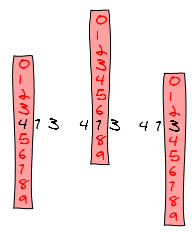
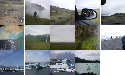
I’m working a lot with URLs that contain ids and very often, I made a mistake in one digit of the long id and end up with a completely different element. If I don’t pay attention, then I end up looking at two elements thinking they are the same and am intrigued until I find out the mistake.

In order to avoid that, I wanted to know if I could make a sequence of ids where making one mistake would not give a valid id. For example, if you have the id 473, then you have to black list all the ids where the first digit is wrong (073, 173, 273, 373, 573, 673, 773, 873, 973) and the second being wrong (403, 413, 423, 433, 443, 453, 463, 483, 493) and the last one (470, 471, 472, 474, 475, 476, 477, 478, 479).
Here is the list of the first pseudo-numbers:

#pseudo-list li { float: left; margin-left: 65px; }

  1. 011
  2. 022
  3. 033
  4. 044
  5. 055
  6. 066
  7. 077
  8. 088
  9. 099
  10. 101
  11. 110
  12. 123
  13. 132
  14. 145
  15. 154
  16. 167
  17. 176
  18. 189
  19. 198
  20. 202
  21. 213
  22. 220
  23. 231
  24. 246
  25. 257
  26. 264
  27. 275
  28. 303
  29. 312
  30. 321
  31. 330
  32. 347
  33. 356
  34. 365
  35. 374
  36. 404
  37. 415
  38. 426
  39. 437
  40. 440
  41. 451
  42. 462
  43. 473
  44. 505
  45. 514
  46. 527
  47. 536
  48. 541
  49. 550
  50. 563
  51. 572
  52. 606
  53. 617
  54. 624
  55. 635
  56. 642
  57. 653
  58. 660
  59. 671
  60. 707
  61. 716
  62. 725
  63. 734
  64. 743
  65. 752
  66. 761
  67. 770
  68. 808
  69. 819
  70. 880
  71. 891
  72. 909
  73. 918
  74. 981
  75. 990

And here is a visual representation of those numbers:

For each digit in the number, we blacklist 9 other numbers. For a 5 digits number (eg 12345), that means blacklisting 45 numbers. For a 10 digits number (eg 1234567890), that means blacklisting 90 numbers. The number of blacklisted numbers only grows at a logarithmic scale.

In order to see how many numbers we lose, I plotted the ratio of pseudo numbers count compared to the real numbers. We can roughly keep one number every fifteen. But the good news is that the ratio doesn’t fall off the chart as the numbers grow.

Looking at the numbers, they looked like to go from 10 to 10 but with some huge spikes and sometimes they were closer. So I plotted the difference between two consecutive numbers in a chart and it looks like the difference is centered around 10. But the variance is getting higher and higher as you move further.

I’m not really sure if this sequence can be really useful in practice but that was a fun week-end experiment. I hope it’ll give you some, hopefully useful, ideas 🙂

Layout Algorithms: Facebook | Google Plus | Lightbox | Lightbox Android | 500px

I contacted the CEO of Lightbox to share some thoughts about its layout algorithm and he told me this wasn’t the only one they made. Here is the description of another interesting algorithm 🙂

How does it work?

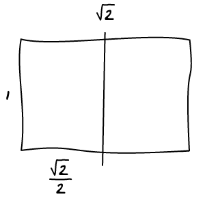
The golden nugget in the whole equation being the square root of two! Anything with the aspect ratio of 1.41421 (square root of two) can be divided in half and produce two more with the same aspect ratio. And as this was close enough to 4:3 (or 3:4) we were able to crop the photos in the collage view to this aspect ratio without it being too noticeable. This way we could have an arbitrary list of landscape and portrait photos and still generate a suitable layout. — Nilesh Patel

Let’s take an example, we have an image where the height is 1 and width is square root of 2.

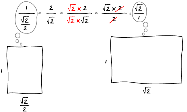
Let’s split it in half horizontally and calculate the aspect ratio of both the new and old images.

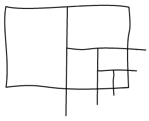
They are both the same 🙂 It means that you can split the image as many time as you want and you will always keep the same aspect ratio:

How much do you crop?

Let’s say we have an image of 300 pixels in width, the image would be 300/(4/3) = 225px in height but instead is 300/sqrt(2) = 212.12px. It’s a 12ish pixels difference, 6 pixels on each side. Let’s look at how it looks in practice. The dark part is the full image and light one is the viewport.

#outer-lightbox-android {
width: 300px;
height: 219px;
background-color: #666;
padding-top: 6px;
margin: 0 auto;
}
#inner-lightbox-android {
width: 300px;
height: 213px;
background-color: #ccc;
}

​If you want to be rigorous, you also have to remove few pixels of padding every time you split the image in half. But that’s only another 2 or 3 pixels per split, that’s still a pretty good approximation.

Image Sizes

In order to keep images good looking, you have to set a minimum and maximum allowed size. Every time a split happens, the resulting image is half the size. Portrait and landscape images alternate at every split. This means that the next image with the same orientation is going to be a quarter of the previous image.

In practice, you can only have two sizes for each orientation or the images are either way too big or way too small. You end up with two different sizes for each orientation. This is good, each image must now only be labelled by “big” or “small” by the algorithm.

Another thing to keep in mind is that two images with a different orientation cannot have the same area. The closest setup you can have is one being two times bigger (or smaller) than the other one. The tricky thing is that this choice is not per image basis but global to the layout. At the beginning, you have to chose one orientation that is going to be twice as big as the other, this choice may not be easy to do.

Conclusion

Check out the Demo!

Pros:

  • Works with both landscape and portrait
  • Can chose between two sizes for each orientation
  • No holes

Cons:

  • Having to chose an orientation that is going to be twice as big as the other
  • Ordering isn’t really respected when there are many sizes and orientations
  • Small cropping
  • End of stream is tricky to implement

Best Cropping Position

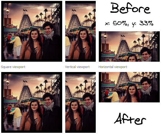
In Facebook image layout algorithm, we use square viewport to display the images. Since images are not usually square, we have an issue to solve.

Contain Cover

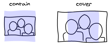
There are two possible ways to deal with it. You make the image fit entirely in the viewport and add black borders (think about viewing 4/3 movies in a wide screen). Or you can make the viewport fit entirely in the image. Instead of having black bars, you are going to remove some parts of the image.

In CSS, the names for those two concepts are implemented with background-size property that has two values: contain and cover.

In our case, we display images in a grid. The cover version works best because the images align nicely in the grid. It makes the edges much more visible that gives a structure to the page.

Set up the problem

The choice we made raises another issue: we are no longer displaying the entire photo but only a subset of it. Therefore we have to know what parts of the image we want to keep, and what parts we want to hide.

The first thing to notice, is that there is only one degree of freedom. You can either pan the image horizontally or vertically depending on the aspect ratio of the image and viewport.

In order to make that decision, we need to have an idea of what is important in the image. Thankfully, at Facebook, people can tag the images and tell us where the people and other point of interests are. We also know that people are important so we also use detected faces. In the future we could automatically find more such as text, animals …

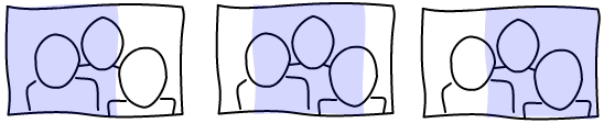
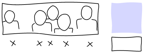
Now we have a clearer view of the inputs. We have a set of point of interests aligned in one dimension. We also have a window that we can slide on this dimension. Here’s an example:

Find maximal window

The idea of the algorithm is to find the position of the window that maximizes the number of point of interests it contains.

A window can be defined only by its starting position since its width is constant. This makes the search space to be the number of pixels in a column/line of the image (minus the size of the window as it must not go outside). Then for each position, you have to compute how many points are inside.

A naive implementation is going to be in the order of O(p * n) where p is the number of pixels and n the number of point of interests. For a typical image with people this means 960 * 3 = 2880 checks. This is way too costly because the number of pixels is an order of magnitude higher than the number of point of interests.

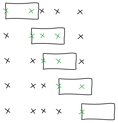
We want to approach the problem the starting from the point of interests. A window can contain, or not, a point of interest. Two windows next to each other that contain the same point of interests can be considered equivalent. With this definition, we can find all the windows much quicker.

We are going to iterate on all the point of interests and consider that they are in the left-most edge of the window. This is the boundary between it between inside and outside of the window. We compute how many points are in that window and keep it if it’s bigger than what we had before.

In order to implement this effectively, we can iterate on all the point of interests in O(n). Using binary search, we find the right-most point in O(log(n)), if the points of interests are sorted. It’s a O(n * log(n)) to sort them at the beginning.

The total complexity is therefore O(n * log(n)), where n is the number of point of interests. Since most of our images have less than 10 point of interests, our algorithm is essentially free.

Center the window

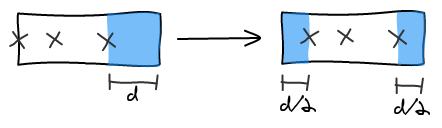
With a window aligned on the left element, we can balance the right padding equally across left and right to center the window.

The previous algorithm can return multiple windows that have the same number of points of interest. In this case, we use the window that has the bigger amount of padding. This ensures that heads are less likely to be cut-off in half.

Force someone inside

When you are viewing all the photos someone is tagged in, you would like to make sure that the person isn’t being cropped out by the algorithm. Previously, what was done was to center the image on that person. We could instead keep using the current algorithm but force the person in.

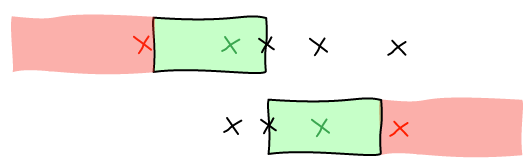
Again, we are going to look at the boundaries. The person can be from the left edge to the right one. So we are going to place the person at the left and right of the viewport and remove all the points that cannot be in the same screen.

Then, we have the guarantee that all the sets of points we are going to chose also contain the person. We run the algorithm again with that limited set of points to find the window.

Conclusion

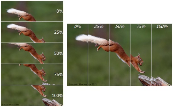
The current heuristic is to have images horizontally centered and vertically centered at the first third of the photo, where most faces at. Those are empiric values that work surprisingly well. Also, most images are 4:3, therefore cropping to a 1:1 ratio removes 25% of the photo total, which is only 12.5% on each side.

In order to test the algorithm, we use more extreme viewports. A quick run on my photos and some friends photos shows that it either leaves the crop as is or improves it. It is going to be interesting to test it on Facebook views.

CSS – Semi-transparent Border on Images

With the new Facebook image gallery redesign, images are displayed using white padding as separation. It works well most of the time but fails for images with a light background.

To get around it, a 1px semi-transparent border is applied inside the image. This way it doesn’t affect dark images and makes a cleaner separation for light ones.

Without border

With border

How to

Here’s the CSS magic:

.image:after {	
  border: 1px solid rgba(0, 0, 0, 0.1);
  content: '';
 
  position: absolute;
  top: 0;
  right: 0;
  bottom: 0;
  left: 0;
}

position: absolute;
top: 0;
right: 0;
bottom: 0;
left: 0;
}

Conclusion

It’s a very small change but it makes the gallery look a lot better. If you are displaying images in a white background without borders, you might consider using this trick too 🙂

Image Layout Algorithm – 500px

Layout Algorithms: Facebook | Google Plus | Lightbox | Lightbox Android | 500px

500px‘s front-page uses an interesting image layout algorithm. It stands out from the other ones as it does not use any algorithm nor mathematical properties to be computed. Instead it is based on patterns.

How does it work?

Basic shapes

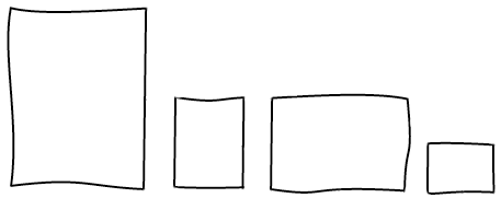
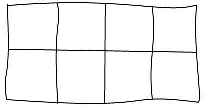
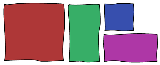
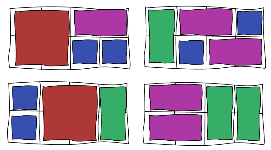
The idea behind the layout is to use a 4×2 canvas and 4 basic shapes. The game is to fill the canvas with those shapes without any hole. The page is just a succession of those canvas with different shapes combination. Here are some examples:

The choice of which combination of shapes to use can be driven by the images you want to display. If you are displaying an image that you want to highlight, you’re going to chose the big square, whereas a portrait image is going to use the vertical bar and so on.

Combination

If you are curious, there are 90 possible combinations:

oooo  oooo  oooo  oooo	oooo  ooo|  ooo|  ooo|	oo##  oo##  oo|o  oo|o  oo||  oo||  oo--
oooo  oo--  o--o  --oo	----  ooo|  o--|  --o|	oo##  --##  oo|o  --|o  oo||  --||  oooo
 
oo--  oo--  oo--  oo--  o##o  o##|  o|oo  o|oo  o|o|  o|##  o||o  o|||  o|--  o|--  o--o
oo--  o--o  --oo  ----  o##o  o##|  o|oo  o|--  o|o|  o|##  o||o  o|||  o|oo  o|--  oooo
 
o--o  o--o  o--o  o--o  o--|  o--|  o--|  ##oo  ##oo  ##o|  ####  ##|o  ##||  ##--  ##--
oo--  o--o  --oo  ----  ooo|  o--|  --o|  ##oo  ##--  ##o|  ####  ##|o  ##||  ##oo  ##--
 
|ooo  |ooo  |ooo  |oo|  |oo|  |o##  |o|o  |o||  |o--  |o--  |o--  |##o  |##|  ||oo  ||oo
|ooo  |o--  |--o  |oo|  |--|  |o##  |o|o  |o||  |ooo  |o--  |--o  |##o  |##|  ||oo  ||--
 
||o|  ||##  |||o  ||||  ||--  ||--  |--o  |--o  |--o  |--|  |--|  --oo  --oo  --oo  --oo
||o|  ||##  |||o  ||||  ||oo  ||--  |ooo  |o--  |--o  |oo|  |--|  oooo  oo--  o--o  --oo
 
--oo  --o|  --o|  --o|  --##  --##  --|o  --|o  --||  --||  ----  ----  ----  ----  ----
----  ooo|  o--|  --o|  oo##  --##  oo|o  --|o  oo||  --||  oooo  oo--  o--o  --oo  ----

oo– oo– oo– oo– o##o o##| o|oo o|oo o|o| o|## o||o o||| o|– o|– o–o
oo– o–o –oo —- o##o o##| o|oo o|– o|o| o|## o||o o||| o|oo o|– oooo

o–o o–o o–o o–o o–| o–| o–| ##oo ##oo ##o| #### ##|o ##|| ##– ##–
oo– o–o –oo —- ooo| o–| –o| ##oo ##– ##o| #### ##|o ##|| ##oo ##–

|ooo |ooo |ooo |oo| |oo| |o## |o|o |o|| |o– |o– |o– |##o |##| ||oo ||oo
|ooo |o– |–o |oo| |–| |o## |o|o |o|| |ooo |o– |–o |##o |##| ||oo ||–

||o| ||## |||o |||| ||– ||– |–o |–o |–o |–| |–| –oo –oo –oo –oo
||o| ||## |||o |||| ||oo ||– |ooo |o– |–o |oo| |–| oooo oo– o–o –oo

–oo –o| –o| –o| –## –## –|o –|o –|| –|| —- —- —- —- —-
—- ooo| o–| –o| oo## –## oo|o –|o oo|| –|| oooo oo– o–o –oo —-

If you are to implement this algorithm, you may want to keep only the combinations that are visually interesting. Only horizontal images could be boring for example.

Crop

The main issue with this layout is the use of unusual aspect ratios. Most photographic images are taken with cameras and therefore have an aspect ratio close to 4/3. As soon as you want to fit a 4/3 image in a narrower aspect ratio, you will have to cut a large part of the image.

Since 500px is all about high quality images, they let the users define all the different crops in use. Because of this, they only use this algorithm in their front-page where they display few images every day. The reason is that badly cropped images can ruin the preview. Here is an example with different cropping values (using CSS percentage values for position):

To reduce the impact of this issue, they don’t use square sizes as I presented in the examples. Instead, they use sizes that are closer to 4/3, both vertically and horizontally, as well as panorama.

Conclusion

Check out the Demo!

This layout is good if you have many portrait and panorama images and want to make some of them bigger. However, it introduces many cropping issues. If you want to use it, make sure you allow users to chose the crops before they are displayed or you risk ruining their photos.

Pros:

  • Can make any images bigger
  • Can chose between 4 image dimensions
  • Can chose between a lot of combinations
  • No holes

Cons:

  • Important cropping
  • Need some tweaks to handle the end of stream
  • Fixed number of columns

In this article, we are going to see how to support dynamic updates to Facebook Image Layout Algorithm. Beware, this is not an easy task and there are many special cases to handle 🙂

Making images bigger

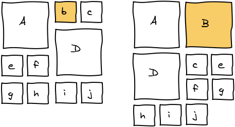
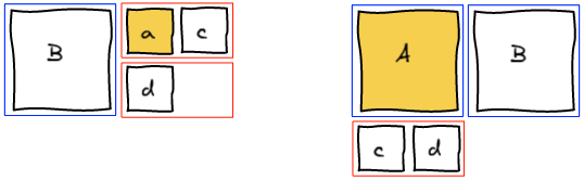
To make images bigger we just run the algorithm all over again with the new image being big. For example, making b big will lead to the following layout.

In order to make it a better user experience, we want to smoothly transition the images positions and sizes. We do it using CSS Transitions. In Javascript, we update the size and dimension of all the elements and add 2 lines of CSS to get the magic.

transition-property: top, left, width, height;
transition-duration: 500ms;

Reordering

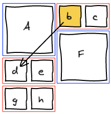
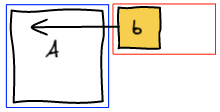
Let’s start with a small example. We want to move b where d is.

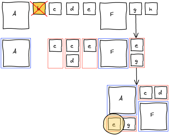
The first thing we do is to remove b from the list of elements. Then, we rerun layout algorithm until we are about to add a block at the spot where we want b to be.

Insert Before

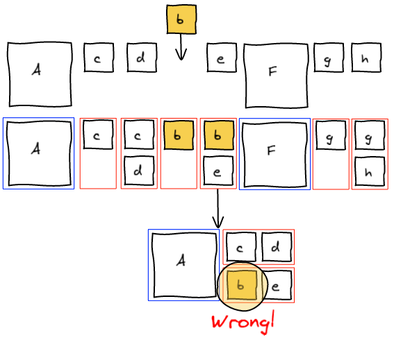
At this point, we realize that b needs to be at the spot where e is. The natural answer is to insert b right before e and re-run the layout algorithm.

However this is not working as expected. Adding b before e groups them together before F.

Insert and canonicalize

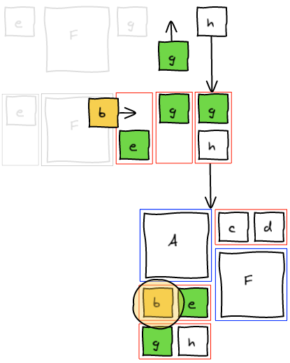
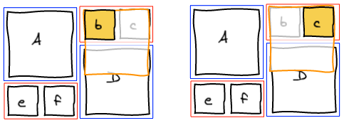
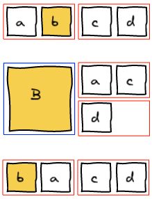
The previous method tried to change the past. One knows that changing the past also changes the future 🙂 Instead, what we want to do is to fix the present and let time go on. We are going to insert b to the temporary block, layout that block and insert g (that was previously in the temporary block) right after in the list. This way, we get the layout we wanted.

At this point, we completely blew up the sequence that lead to this layout. Instead of trying hard to move elements around to get a valid sequence, we’re going to be smarter. We managed to get the layout we wanted. Well, let’s just read that layout and build a valid sequence out of it. I call this a canonical sequence.

Handle all the cases!

Now that we have the general framework, we need to see how to “fix the present” in all the different cases.

Small -> Small

As seen in the example, we insert the small element at the right position in the block and move the last element of the block back into the list of elements to be processed.

Big -> Small | Big -> Top of Big

Those two cases are also really easy. We layout the big element we are trying to insert and then layout the block without any modification.

Small -> Top of Big

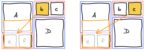
This one is more tricky. We want to find another small image so that we’ve got two to form a small block.

  • If at this point, there’s a temporary small block that is not empty, then perfect, we add the small image we want to insert at the end of the block and layout it.
  • If not, we’re going to look for the first small image in the list of elements left to be processed. With this image, we’re going to form a small block and layout it. Note: if there are many big images, the small image can be pulled from quite a long distance.
  • If there’s no small image left, we’re going to layout a small block with only the image we want to insert. We’ll discuss why it is okay later.

Small -> Bottom of Big | Big -> Bottom of Big


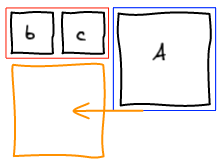
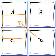
And now comes the hard part. First, you’ve got to be warned, there isn’t always a solution for this problem. For example, whatever ordering you chose, you are never going to be able to move D at the bottom of A.

Let’s take an example where it is actually possible. We want to move D at the bottom of A.

We start the algorithm and run into the conflicting situation on the first element.

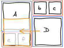
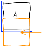
The idea here is to pull small elements from the rest of the list in order to make a small block at this position. Once it is done, the other column is going to be filled with the big block that was conflicting and we’re back to the column we were initially. Only this time, we are one row lower. And this makes a big difference. Whatever we are about to layout here is either a small block or the top of a big block. We already know how to handle those two cases.

If there isn’t enough small elements remaining in the stream to form a small block, we’re not able to find a solution. There may be a solution if we allow to update the past, but as we’ve seen earlier, this is a tricky business.

We cannot just stop here and raise an error: no solution found. Instead, a trade-off we can make is to put the element we are trying to insert at the top of the big block instead of the bottom. This is obviously not perfect but is the best user experience I was able to find.

Last small element

The last issue we’re going to cover in this article is how to handle the last small element. Imagine we’re in the situation where there are 2 images, one big and one small. You are trying to move the small element before the big one.

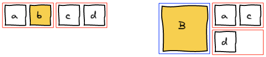
With the algorithm I explained, you are never going to be able to handle this case. There are only two possible ordering: Ab and bA. But both put the big image first and the small image second.

Priority on small blocks

The main issue here is that the big block has the priority over the small one. You can change the algorithm such that as soon as you see a small element, you pull the next small one from the list to make a block. This fixes the issue here but introduces a side effect when making photos bigger.

In a canonical stream, when you make an image bigger, you’ve got a nice property that it always expand in the same column and to the bottom.

When you change the priority, the other small image of the block is going to take precedence. Therefore the (now bigger) image is going to move to the other column. This is not a good user experience.

We could reorder the stream and move the image at the right position using the algorithms we’ve seen previously. However, not all the streams are reorderable. In Facebook case, only the photos in an album are reorderable. All the other streams are sorted by time, so reordering is not acceptable.

Priority on small blocks with only one image

The solution is to change the priority but only for a special case: when there are no more small images left to make a full small block. We still maintain all the benefits of having small blocks having a lower priority than big blocks, but at the same time fix the issue with the last lonely small block.

Bigger Images and Ordering

When making images bigger, we change the order of the stream as seen previously. For example, let’s make b bigger in the following example.

So far so good, B expanded in its column and below. Now we are going to make a bigger.

And … it’s unexpected … A and B just swapped behind our eyes for no apparent reason. You have to understand the algorithm to figure out what is going on. a when small was put after B because it didn’t have the precedence. But, when you make A big, it gets back its precedence.

Canonicalize

A solution is to canonicalize the stream every time you highlight an image. This fixes the issue we described but introduces another one. Making a photo bigger is intuitively an operation that is reversible. When we make an image bigger and right after make it smaller, we expect that we get back to the original position. If you canonicalize after making it bigger, this property no longer holds true.

In the following example, a and b get inverted after making b bigger then smaller.

Since we cannot reorder images in the stream in Facebook, we did not try to find a better solution. We just stay with the unexpected behavior.

Conclusion

Check out the Demo! (Note: this is an earlier version, the most obscure tricks are not handled the same way and don’t work all the time)

The transition from a static layout algorithm to a dynamic one was not an easy task. But in the end, we’ve been able to figure out all the edge cases and have a solution for each of them.

The issues arise when there are many big images and not enough small ones to do the various balancing operations. Hopefully the user are going to be moderate and don’t make all the images of their stream big 🙂

Image Layout Algorithm – Facebook

Layout Algorithms: Facebook | Google Plus | Lightbox | Lightbox Android | 500px

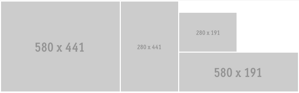
For the redesign of the Photo Section of Facebook we wanted to highlight some photos by making them bigger. It all started with the following mock by Andy Chung:

Layout

Alternated Blocks

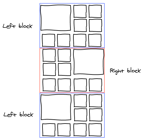
My first shot at the problem was to make a fixed layout where we would alternate big images on the left and on the right.

With this scheme, you have one big image every 9. We started brainstorming about putting the one with the most number of likes and comments there. However, this felt to be very arbitrary.

Emily Grewal, the Product Manager of the project wanted something better: being able to make any (and all) image bigger. Automatic selection of images to be bigger was also discarded as we wanted the user to feel in control of this space.

Big and Small Blocks

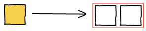
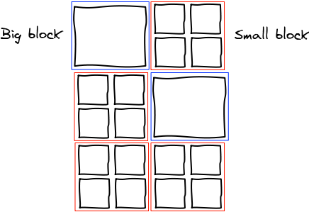
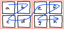
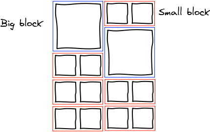
In the next iteration, I tried to give more control by reducing the size of the blocks. Now it is either one big image or 4 small ones.

One constraint we had at the time was that the columns could start at an arbitrary height. With this layout, we can make the block display: inline-block; and the browser is going to reorder them automatically as the columns initial height are changing.

However, this wasn’t all shiny. One nasty side effect is the fact that the ordering of two small blocks next to each other is awkward. Instead of being from left to right they are in zig-zag. You could linearize those but you would lose the layout from CSS.

Smaller Small Blocks

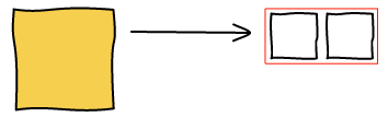
The next (and final) idea is to shrink the small blocks from 4 to 2 elements. It solves our zig-zag issue and feels more natural.

Algorithm

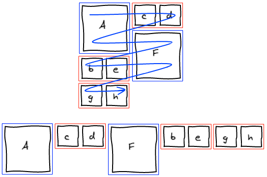
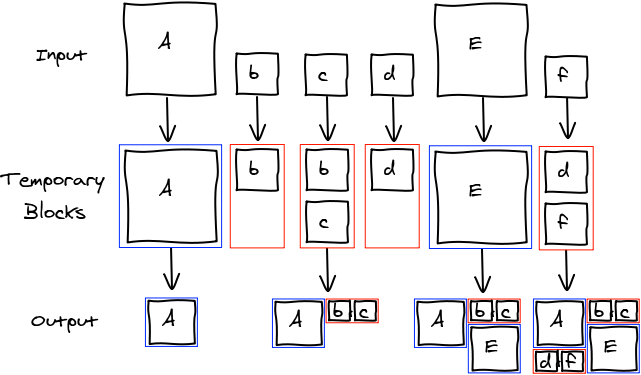
The idea behind the algorithm is to have temporary blocks that serve as buffer. We iterate over all the input elements and put them into the temporary block of the corresponding size. Once a temporary block is full, we add it into the grid in the smallest column.

Here’s an example where we try to layout AbcdEf:

And there’s the pseudo-code implementation of the algorithm:

function layout(elements) {
  var columns = [new Column(/*height */ 0), new Column(/*height */ 0)];
  var stash = [];
 
  elements.forEach(function (element) {
    if (element.isBig()) {
      var column = columns.getSmallestColumn();
      column.renderBigBlock(element);
      column.height += 2;
 
    } else /* element.isSmall() */ {
      stash.push(element);
      if (stash.length === 2) {
        var column = columns.getSmallestColumn();
        column.renderSmallBlock(stash[0], stash[1]);
        column.height += 1;
        stash = [];
      }
    }
  });
 
  if (stash.length > 0) {
    var column = columns.getSmallestColumn();
    column.renderSmallBlock(stash[0], stash[1] /* can be undefined */);
    column.height += 1;
  }
}

elements.forEach(function (element) {
if (element.isBig()) {
var column = columns.getSmallestColumn();
column.renderBigBlock(element);
column.height += 2;

} else /* element.isSmall() */ {
stash.push(element);
if (stash.length === 2) {
var column = columns.getSmallestColumn();
column.renderSmallBlock(stash[0], stash[1]);
column.height += 1;
stash = [];
}
}
});

if (stash.length > 0) {
var column = columns.getSmallestColumn();
column.renderSmallBlock(stash[0], stash[1] /* can be undefined */);
column.height += 1;
}
}

Conclusion

Check out the Demo!

This is the layout algorithm we ended up using for Facebook photos. We found a way to let the user make all the images he wants bigger minimizing the risk of the result being ugly.

Pros:

  • Can make any/all image bigger
  • No holes
  • Order is mostly respected
  • Need to store only two sizes per image

Cons:

  • All images have the same dimension
  • Cropping required to display both landscape and portrait images
  • Only works for a number of column that is a multiple of 2

If you want to know how reordering works, read the follow-up article 😉

CSS – Cross Browser Drag Cursor

grab and grabbing are two great CSS cursors you can use when you are moving things around.

Windows: Mac:

Since those are not standard, it is really tricky to get them working cross browser. This article is going to show you all the available workarounds to get the best version working everywhere.

Browsers

Firefox

The grab icons were first introduced in Firefox 1.5 (November 29, 2005).

.grab { cursor: -moz-grab; }
.grabbing { cursor: -moz-grabbing; }

Chrome & Safari on Mac & Linux

The cursor were then introduced on Webkit in March 2008 but only for Mac. The cursors are also working on Linux.

.grab { cursor: -webkit-grab; }
.grabbing { cursor: -webkit-grabbing; }

Chrome Windows

However, the icons don’t work on Windows. This is even more vicious as the CSS rule is being parsed and accepted, but it doesn’t change the cursor. Therefore you cannot do something like this:

.grab {
  cursor: move;
  cursor: -webkit-grab; /* NOT WORKING */
}

You have to do two distinct rules, one for Windows and one for Mac & Linux.

There is a way to get the cursor working using a custom cursor. Fortunately for us, Google already did the asset in Gmail and Google Maps.

.grab { cursor: url(https://mail.google.com/mail/images/2/openhand.cur) 8 8, move; }
.grabbing { cursor: url(https://mail.google.com/mail/images/2/closedhand.cur) 8 8, move; }

Internet Explorer 7, 8, 9

Now, as usual, Internet Explorer doesn’t support everything. You cannot specify the relative position of the cursor. This is not the end of the world, we can just ignore it and the cursor will be slightly misaligned. Since the cursor isn’t a pointer, this is not an issue in practice.

.grab { cursor: url(https://mail.google.com/mail/images/2/openhand.cur), move; }
.grabbing { cursor: url(https://mail.google.com/mail/images/2/closedhand.cur), move; }

I did not test IE6 nor IE10. If you know something about those please leave a comment 🙂

Opera

Opera doesn’t have any support for custom cursors. So we can use the move cursor that is less than ideal but gives the idea of movement.

.grab, .grabbing { cursor: move; }

Conclusion

I made this jsFiddle to test all the different ways to show cursors. You can play with it to handle browsers I did not list here.

There is a viable solution for all the major browsers except Opera. Sadly, I couldn’t find a way to do feature detection in order to see which version to use in which case. Also, because of the Webkit issue on Windows, you cannot make a simple sequence of rules and let the browser ignores the ones he doesn’t know. You have to get a browser sniffing library and include the appropriate rule for the browser.

Some related articles that helped me come to the solution. Note that no one is successfully managing to get it working on all the browsers.