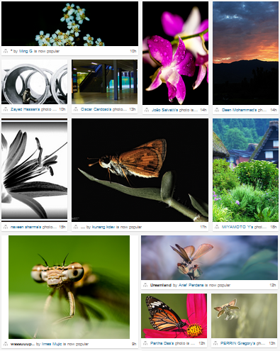
500px's front-page uses an interesting image layout algorithm. It stands out from the other ones as it does not use any algorithm nor mathematical properties to be computed. Instead it is based on patterns.
How does it work?
Basic shapes
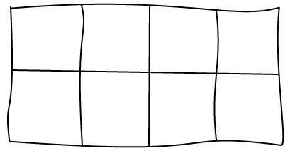
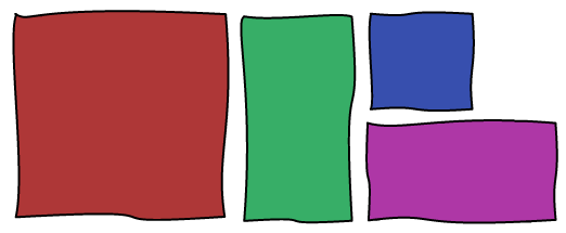
The idea behind the layout is to use a 4x2 canvas and 4 basic shapes. The game is to fill the canvas with those shapes without any hole. The page is just a succession of those canvas with different shapes combination. Here are some examples:
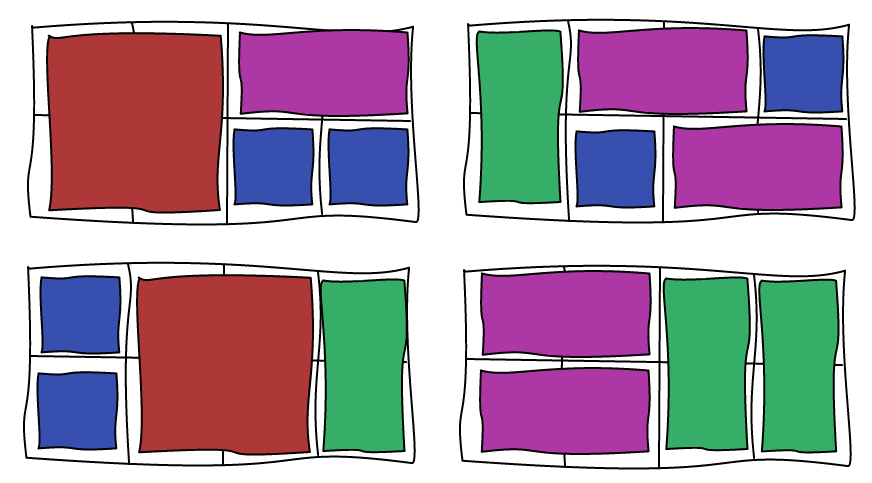
The choice of which combination of shapes to use can be driven by the images you want to display. If you are displaying an image that you want to highlight, you're going to chose the big square, whereas a portrait image is going to use the vertical bar and so on.
Combination
If you are curious, there are 90 possible combinations:
oooo oooo oooo oooo oooo ooo| ooo| ooo| oo## oo## oo|o oo|o oo|| oo|| oo-- oooo oo-- o--o --oo ---- ooo| o--| --o| oo## --## oo|o --|o oo|| --|| oooo oo-- oo-- oo-- oo-- o##o o##| o|oo o|oo o|o| o|## o||o o||| o|-- o|-- o--o oo-- o--o --oo ---- o##o o##| o|oo o|-- o|o| o|## o||o o||| o|oo o|-- oooo o--o o--o o--o o--o o--| o--| o--| ##oo ##oo ##o| #### ##|o ##|| ##-- ##-- oo-- o--o --oo ---- ooo| o--| --o| ##oo ##-- ##o| #### ##|o ##|| ##oo ##-- |ooo |ooo |ooo |oo| |oo| |o## |o|o |o|| |o-- |o-- |o-- |##o |##| ||oo ||oo |ooo |o-- |--o |oo| |--| |o## |o|o |o|| |ooo |o-- |--o |##o |##| ||oo ||-- ||o| ||## |||o |||| ||-- ||-- |--o |--o |--o |--| |--| --oo --oo --oo --oo ||o| ||## |||o |||| ||oo ||-- |ooo |o-- |--o |oo| |--| oooo oo-- o--o --oo --oo --o| --o| --o| --## --## --|o --|o --|| --|| ---- ---- ---- ---- ---- ---- ooo| o--| --o| oo## --## oo|o --|o oo|| --|| oooo oo-- o--o --oo ---- |
If you are to implement this algorithm, you may want to keep only the combinations that are visually interesting. Only horizontal images could be boring for example.
Crop
The main issue with this layout is the use of unusual aspect ratios. Most photographic images are taken with cameras and therefore have an aspect ratio close to 4/3. As soon as you want to fit a 4/3 image in a narrower aspect ratio, you will have to cut a large part of the image.
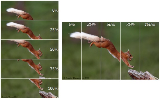
Since 500px is all about high quality images, they let the users define all the different crops in use. Because of this, they only use this algorithm in their front-page where they display few images every day. The reason is that badly cropped images can ruin the preview. Here is an example with different cropping values (using CSS percentage values for position):
To reduce the impact of this issue, they don't use square sizes as I presented in the examples. Instead, they use sizes that are closer to 4/3, both vertically and horizontally, as well as panorama.

Conclusion
Check out the Demo!
This layout is good if you have many portrait and panorama images and want to make some of them bigger. However, it introduces many cropping issues. If you want to use it, make sure you allow users to chose the crops before they are displayed or you risk ruining their photos.
Pros:
- Can make any images bigger
- Can chose between 4 image dimensions
- Can chose between a lot of combinations
- No holes
Cons:
- Important cropping
- Need some tweaks to handle the end of stream
- Fixed number of columns
