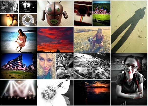
I contacted the CEO of Lightbox to share some thoughts about its layout algorithm and he told me this wasn't the only one they made. Here is the description of another interesting algorithm 🙂
How does it work?
The golden nugget in the whole equation being the square root of two! Anything with the aspect ratio of 1.41421 (square root of two) can be divided in half and produce two more with the same aspect ratio. And as this was close enough to 4:3 (or 3:4) we were able to crop the photos in the collage view to this aspect ratio without it being too noticeable. This way we could have an arbitrary list of landscape and portrait photos and still generate a suitable layout. -- Nilesh Patel
Let's take an example, we have an image where the height is 1 and width is square root of 2.
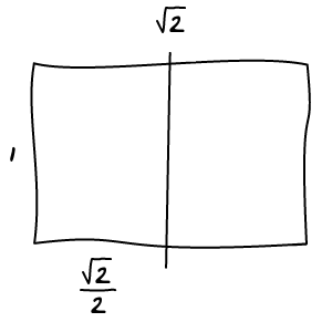
Let's split it in half horizontally and calculate the aspect ratio of both the new and old images.
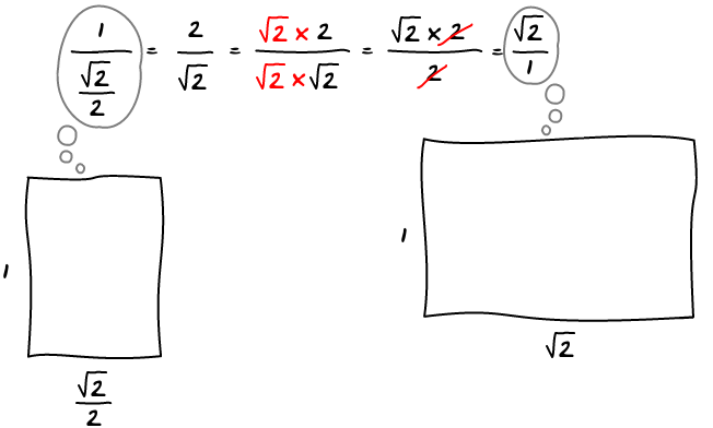
They are both the same 🙂 It means that you can split the image as many time as you want and you will always keep the same aspect ratio:
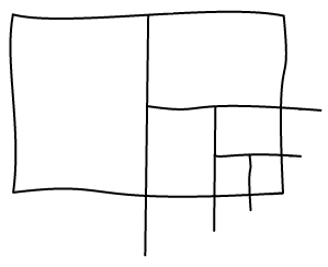
How much do you crop?
Let's say we have an image of 300 pixels in width, the image would be 300/(4/3) = 225px in height but instead is 300/sqrt(2) = 212.12px. It's a 12ish pixels difference, 6 pixels on each side. Let's look at how it looks in practice. The dark part is the full image and light one is the viewport.
If you want to be rigorous, you also have to remove few pixels of padding every time you split the image in half. But that's only another 2 or 3 pixels per split, that's still a pretty good approximation.
Image Sizes
In order to keep images good looking, you have to set a minimum and maximum allowed size. Every time a split happens, the resulting image is half the size. Portrait and landscape images alternate at every split. This means that the next image with the same orientation is going to be a quarter of the previous image.
In practice, you can only have two sizes for each orientation or the images are either way too big or way too small. You end up with two different sizes for each orientation. This is good, each image must now only be labelled by "big" or "small" by the algorithm.
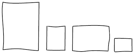
Another thing to keep in mind is that two images with a different orientation cannot have the same area. The closest setup you can have is one being two times bigger (or smaller) than the other one. The tricky thing is that this choice is not per image basis but global to the layout. At the beginning, you have to chose one orientation that is going to be twice as big as the other, this choice may not be easy to do.
Conclusion
Check out the Demo!
Pros:
- Works with both landscape and portrait
- Can chose between two sizes for each orientation
- No holes
Cons:
- Having to chose an orientation that is going to be twice as big as the other
- Ordering isn't really respected when there are many sizes and orientations
- Small cropping
- End of stream is tricky to implement
