JSX for the real DOM

React is bundled with a Javascript transpiler called JSX. It gives the ability to write <html> tags within Javascript. The advertised way to use JSX is React.DOM to create React light DOM elements, but it is not the only way. We can create another JSX backend, called JSXDOM, to create real DOM elements.

Example

Here is an example (JSFiddle) of how the code looks like with JSX and JSXDOM:

/** @jsx JSXDOM */
 
var defaultValue = "Fill me ...";
 
document.body.appendChild(
  <div>
    <input type="text" value={defaultValue} />
    <button onclick="alert('clicked!');">Click Me!</button>
    <ul>
      {['un', 'deux', 'trois'].map(function(number) {
        return <li>{number}</li>;
      })}
    </ul>
  </div>
);

var defaultValue = "Fill me …";

document.body.appendChild(
<div>
<input type="text" value={defaultValue} />
<button onclick="alert(‘clicked!’);">Click Me!</button>
<ul>
{[‘un’, ‘deux’, ‘trois’].map(function(number) {
return <li>{number}</li>;
})}
</ul>
</div>
);

Advantages

There are many libs that attempt to do this in pure Javascript (dom-o, htmlr, ThinAir …) but none of them look like XML. With JSX, you can copy and paste HTML in your Javascript code and it works (if you close your tags).

The great benefit outside of looking like XML is interpolation. Anything you put inside of {} is a regular Javascript expression. This way you don’t need to learn yet another templating language.

var defaultValue = "Fill me ...";
<input type="text" value={defaultValue} />

It is useful for attributes but even more for children. You can create any array using Javascript functions such as map, filter, reduce, reverse … and pass it down to JSXDOM.

<ul>
  {['un', 'deux', 'trois'].map(function(number) {
    return <li>{number}</li>;
  })}
</ul>

Conclusion

JSX is a very exciting technology that, while being developed for React, can be used standalone and provide benefits on its own.

React & Coffeescript

Multiple people asked what’s the story about JSX and CoffeeScript. There is no JSX pre-processor for CoffeeScript and I’m not aware of anyone working on it. (If you are interested in writing one, you probably should look at CoffeeScriptRedux). Fortunately, CoffeeScript is pretty expressive and we can play around the syntax to come up with something that is usable.

Example

Let’s see how JSX look like with an example:

<div classname="MarkdownEditor">
 
 
<h3>Input</h3>
 
 
  <textarea onkeyup="{this.handleKeyUp}" ref="textarea">    {this.state.value}
  </textarea>
</div>

<h3>Input</h3>

<textarea onkeyup="{this.handleKeyUp}" ref="textarea"> {this.state.value}
</textarea>
</div>

which desugars to the following

React.DOM.div({className: 'MarkdownEditor'}, [
  React.DOM.h3({}, 'Input'),
  React.DOM.textarea({onKeyUp: this.handleKeyUp, ref: 'textarea'},
    this.state.value
  )
])

We can easily translate it to CoffeeScript:

{div, h3, textarea} = React.DOM
(div {className: 'MarkdownEditor'}, [
  (h3 {}, 'Input'),
  (textarea {onKeyUp: @handleKeyUp, ref: 'textarea'},
    @state.value
  )
])

Structure

The translations rules are really easy. The only gotcha is to write the tags wrapped in parenthesis lisp-style. This is the best way I found not to get caught with indentation issues.

# Empty element
#
 
 
<div></div>


(div {})
 
# Text children: You use a string literal
#
 
 
<div>foo</div>


(div {}, 'foo')
 
# Interpolation: You ignore the {} and write the expression as is
#
 
 
<div>{this.state.text}</div>


(div {}, @state.text)
 
# Multiple children: You use the [] notation
#
 
 
<div>
  <b r="">
  <b r="">
</b></b></div>
<b r=""><b r="">
 
 
(div {}, [
  (br {}),
  (br {})
])
 
# Attributes: You write them using {} notation
#
 
 
<div onclick="{this.onClick}"></div>


(div {onClick: @onClick})
</b></b>

<div></div>

(div {})

# Text children: You use a string literal
#

<div>foo</div>

(div {}, ‘foo’)

# Interpolation: You ignore the {} and write the expression as is
#

<div>{this.state.text}</div>

(div {}, @state.text)

# Multiple children: You use the [] notation
#

<div>
<b r="">
<b r="">
</b></b></div>
<b r=""><b r="">

(div {}, [
(br {}),
(br {})
])

# Attributes: You write them using {} notation
#

<div onclick="{this.onClick}"></div>

(div {onClick: @onClick})
</b></b>

Demos

I’ve re-written all the React front-page examples using CoffeeScript. The translation was really easy.

Hello World

Timer

Todo

Markdown

Custom Components: React & x-tags

Using x-tags from Mozilla, we can write custom tags within the DOM. This is a great opportunity to be able to write reusable components without being tied to a particular library. I wrote x-react to have them being rendered in React.

Example

We’re first going to write a regular React component.

var Hello = React.createClass({
  render: function() { return <div>{'Hello ' + this.props.name}</div>; }
});

Then, we use xreact.register to bind a React component to a custom tag name.

xreact.register('x-hello', Hello);

At this point, any DOM element will be rendered using React.

<x-hello name="World"></x-hello>

The rendered DOM tree lives in the shadow DOM. This lets us manipulate both the component as well as the rendered <div> using Web Inspector.

Anytime you modify the component, whether it is in the inspector or in Javascript with the regular DOM API, React is going to be invoked to update the rendered version.

Behind the scenes

When you call xreact.register, we call xtag.register saying that whenever an DOM element is created, we render a special component called XReact in the shadow root of <x-hello>.

xtag.register('x-hello', {
  lifecycle: {
    created: function() {
      React.renderComponent(
        XReact({element: this}),
        this.createShadowRoot()
      );
    }
  }
});

XReact is a really simple component that takes a DOM node, in this case <x-hello name="World" /> and converts it to the React equivalent: Hello({name: 'World'}).

var XReact = React.createClass({
  render: function() {
    return convertDOMToReact(this.props.element);
  }

MutationObserver gives us a callback whenever the DOM element is changed. We just have to call this.forceUpdate() to make sure the React rendered version stays in sync.

  componentDidMount: function() {
    new MutationObserver(this.forceUpdate.bind(this)).observe(
      this.props.element, {/* all the possible mutations */}
    );
  }
);

That’s it 🙂

Conclusion

It was really easy to make this small bridge in order to be able to create custom tags and have them rendered using React. Unfortunately, this experiment is only working on Chrome as it is relying on MutationObserver and Shadow DOM.

In 2001, Douglas Crockford evangelized private members design pattern and since then has been widely adopted by the Javascript community. However, are they really private?

Javascript is an extremely dynamic language in which it is possible to access a lot of things on way or another. We’ll see how to get a reference to most of the “private” methods you can find in the wild.

Example

Here’s a snippet of code from underscore.js. We are interested in getting a reference to the following “private” functions: lookupIterator and group.

(function() {
  /* ... */
 
  // An internal function to generate lookup iterators.
  var lookupIterator = function(value) {
    return _.isFunction(value) ? value : function(obj){ return obj[value]; };
  };
 
  // An internal function used for aggregate "group by" operations.
  var group = function(obj, value, context, behavior) {
    var result = {};
    var iterator = lookupIterator(value || _.identity);
    each(obj, function(value, index) {
      var key = iterator.call(context, value, index, obj);
      behavior(result, key, value);
    });
    return result;
  };
 
  // Groups the object's values by a criterion. Pass either a string attribute
  // to group by, or a function that returns the criterion.
  _.groupBy = function(obj, value, context) {
    return group(obj, value, context, function(result, key, value) {
      (_.has(result, key) ? result[key] : (result[key] = [])).push(value);
    });
  };
 
  /* ... */
}).call(this);

// An internal function to generate lookup iterators.
var lookupIterator = function(value) {
return _.isFunction(value) ? value : function(obj){ return obj[value]; };
};

// An internal function used for aggregate "group by" operations.
var group = function(obj, value, context, behavior) {
var result = {};
var iterator = lookupIterator(value || _.identity);
each(obj, function(value, index) {
var key = iterator.call(context, value, index, obj);
behavior(result, key, value);
});
return result;
};

// Groups the object’s values by a criterion. Pass either a string attribute
// to group by, or a function that returns the criterion.
_.groupBy = function(obj, value, context) {
return group(obj, value, context, function(result, key, value) {
(_.has(result, key) ? result[key] : (result[key] = [])).push(value);
});
};

/* … */
}).call(this);

Here’s the code to do it: (Demo on JSFiddle)

var lookupIterator;
var group;
 
_.isFunction = function() {
  lookupIterator = arguments.callee.caller;
  group = lookupIterator.caller;
};
_.groupBy();
 
console.log('lookupIterator', lookupIterator);
console.log('group', group);

_.isFunction = function() {
lookupIterator = arguments.callee.caller;
group = lookupIterator.caller;
};
_.groupBy();

console.log(‘lookupIterator’, lookupIterator);
console.log(‘group’, group);

The way it works is by hooking a function deep inside the internals of the module you want to break into and use arguments.callee.caller to get references to all the functions upward.

In this case, it was easy as we could hook _.isFunction. You can break into a lot of functions overriding String.prototype and using __defineGetter__.

Conclusion

Trying to break into existing Javascript code and make it do what you want is an extremely fun exercise. If this topic is of interest to you, take a look at this big list of Javascript attack vectors written by Google Caja team.

Conversion from uint8 to int8 (x 24)

Daniel Baulig, a co-worker at Facebook, told me a little trick related to jDataView function to convert from a uint8 to a int8 in Javascript.

Here’s the version I had:

function getInt8() {
  var b = this.getUint8();
  if (b > Math.pow(2, 7) - 1) {
    return b - Math.pow(2, 8);
  }
  return b;
}

Compare it to his version:

< <function getInt8() {
  return this.getUint8() << 24 >> 24;
}

I was really confused because it seems like it’s doing a no-op. Here’s the full explanation of why the two versions are working.

How it works?

The following table (borrowed from Wikipedia) shows how various 8 bits values are in represented with bits and how they are interpreted in unsigned and signed (using two-complement rule).

.uint8table {margin: 0 auto; border-collapse: collapse; }
.uint8table td, .uint8table th { padding: 2px 5px; border: 1px solid #ccc; text-align: center; }
.uint8table b { background-color: #FFE0ED; font-weight: normal; }
.uint8table i { color: purple; font-style: normal; }
.uint8table .sep td { border-bottom: 2px solid #bbb; }
#hidefirsttwo span:nth-child(1), #hidefirsttwo span:nth-child(2) { display: none; }
#hidefirsttwo span:nth-child(3) { margin-left: -7px; }

Bits uint8 int8
0000 0000 0 0
0000 0001 1 1
0000 0010 2 2
0111 1110 126 126
0111 1111 127 127
1000 0000 128 −128
1000 0001 129 −127
1000 0010 130 −126
1111 1110 254 −2
1111 1111 255 −1

Javascript doesn’t natively have a 8 bit integer type, it only has a 32 bits one. When you put a 8 bit integer into a 32 bits one, Javascript is going to fill the remaining bits on the left with zeros as the following table shows.

Bits int32
0000 0000 … 0000 0000 0
0000 0000 … 0000 0001 1
0000 0000 … 0000 0010 2
0000 0000 … 0111 1110 126
0000 0000 … 0111 1111 127
0000 0000 … 1000 0000 128
0000 0000 … 1000 0001 129
0000 0000 … 1000 0010 130
0000 0000 … 1111 1110 254
0000 0000 … 1111 1111 255

Unfortunately, this doesn’t properly handle negative numbers. Because we use two-complement, we’ve got to fill all the bits with 1 for negative numbers in order to have the same number in a signed 32 bits representation.

Bits int32
0000 0000 … 0000 0000 0
0000 0000 … 0000 0001 1
0000 0000 … 0000 0010 2
0000 0000 … 0111 1110 126
0000 0000 … 0111 1111 127
1111 1111 … 1000 0000 −128
1111 1111 … 1000 0001 −127
1111 1111 … 1000 0010 −126
1111 1111 … 1111 1110 −2
1111 1111 … 1111 1111 −1

So basically, we’ve got to fill the 24 remaining bits on the left with the same first bit we have: 0 for positive numbers and 1 for negative numbers.

This is when the trick comes into place. In javascript, there’s a binary operator: >> >_(Sign-propagating_right_shift)”>Sign-propagating right shift that moves all the bits to the right and fills the missing bits with the first bit.

So all we have to do is to put our 8 good digits to the far left using << and then use the previous trick to fill the bits with the proper ones 🙂

x x < < 24 (x <> 24
0000 0000 … 0000 0000 0000 0000 … 0000 0000 0000 0000 … 0000 0000
0000 0000 … 0000 0001 0000 0001 … 0000 0000 0000 0000 … 0000 0001
0000 0000 … 0000 0010 0000 0010 … 0000 0000 0000 0000 … 0000 0010
0000 0000 … 0111 1110 0111 1110 … 0000 0000 0000 0000 … 0111 1110
0000 0000 … 0111 1111 0111 1111 … 0000 0000 0000 0000 … 0111 1111
0000 0000 … 1000 0000 1000 0000 … 0000 0000 1111 1111 … 1000 0000
0000 0000 … 1000 0001 1000 0001 … 0000 0000 1111 1111 … 1000 0001
0000 0000 … 1000 0010 1000 0010 … 0000 0000 1111 1111 … 1000 0010
0000 0000 … 1111 1110 1111 1110 … 0000 0000 1111 1111 … 1111 1110
0000 0000 … 1111 1111 1111 1111 … 0000 0000 1111 1111 … 1111 1111

It’s often said that XML is very verbose and therefore JSON is better. I wanted to challenge that assumption and find the smallest way to represent any JSON value using XML.

table#xson { border-collapse: collapse; margin: 0 auto; }
table#xson td, table#xson th { border: 1px solid #999; padding: 5px 10px; background-color: transparent; }
table#xson th { text-align: center; }
table#xson .wp_syntax { border: none; background-color: transparent; margin: 0; }
table#xson strong { font-family: monospace; color: black; font-size: 12px; padding-left: 5px; }

Constants
true
<t/> 0
false
<f/> – 1
null
<l/> 0
Number
NaN
<n/> + 1
123.45
<n>123.45</n>
+ 6
String

""
<s/> + 2
"Abcd"
<s>Abcd</s>
+ 4
Array
[]
<a/> + 2
[1, "two", false]
<a>
  <n>1</n>
  <s>two</s>
  <f></f>
</a>
+ 4 – n
Object
{}
<o/> + 2
{
  "first": 1,
  "second": "two",
  "third": false
}
<o>
  <n k="first">1</n>
  <s k="second">two</s>
  <f k="third"></f>
</o>
+ 5 + n

As you can see, the XML counter part is a bit more verbose and less readable because of the way syntax highlighting is setup. However, while it is bigger, it isn’t out of proportion bigger. The structure can be at most twice as big.

Implementation

In order to implement it, I decided to go with the same API as JSON:

  • XSON.stringify(object, formatter, space)
  • XSON.parse(string)

You can play with it on this current page or can check it out on GitHub.

The implementation was more straightforward than I expected thanks to the fact that there’s a XML Parser inside browsers. However, I had to deal with nasty encoding issues 🙁

String encoding

There are some characters such as < and that we want to escape because otherwise they are likely to be problematic while parsing the XML. The way to encode those characters in XML is to use the &#number; notation where number is the character code. For example a is represented by a:

> new DOMParser().parseFromString('<a>&#97;</a>', 'text/xml')
    .getElementsByTagName('a')[0].textContent
"a"

Unfortunately, you cannot express all the characters with this notation. The XML specification introduces Restricted Characters in the following ranges: [#x1-#x8], [#xB-#xC], [#xE-#x1F], [#x7F-#x84] and [#x86-#x9F]. When you try to read those characters, then the XML parser generates an error.

> new DOMParser().parseFromString('<a>&#0;</a>', 'text/xml')
    .getElementsByTagName('a')[0].textContent
"error on line 1 at column 8: xmlParseCharRef: invalid xmlChar value 0"

Instead of fighting with the XML spec, I decided to use my own encoding. I replace the character by u0000. Where the number is an hexadecimal representation of the number padding so it has exactly four digits.

To do that, we need first to escape all the and can use a regex to do it in few lines of code 🙂

function encode(str) {
   return str
     .replace(/\/g, '\\')
     .replace(/[u0000-u0008u000b-u001f&<>"nt]/g, function(c) {
       var hex = c.charCodeAt(0).toString(16);
       while (hex.length < 4) {
         hex = '0' + hex;
       }
       return '\u' + hex;
     });
 }

Then, in order to decode it, we do the opposite: we first decode all the unicode characters and remove the escapes. In order to make sure that the unicode character was not escape, I’m using a small trick. You can count the number of . If it’s an even number, then it is not escaped, otherwise it is escaped!

function decode(str) {
  return str
    .replace(/(\*)\u([0-9a-f]{4})/g, function(match, backslash, n) {
      if (backslash.length % 2 !== 0) {
        return match;
      }
      return backslash + String.fromCharCode(parseInt(n, 16));
    })
    .replace(/\\/g, '\');
}

Image Gallery – Left and Right Areas

Pete Hunt just showed me a cool trick today. When implementing an image gallery, chances are that you are going to let the user click on the image and based on the position, it will either display the next image or previous.

The way you would implement it without too much thought is to let the left part be for the previous action and the right part be for the next action as in the following drawing.

However, usually when you are viewing an image, you want to see the next, not the previous one. You also tend to just want to click anywhere on the image to make it go next. The previous action is not the default use case and is something you actively think about doing.

Instead of being 50%/50%, you can make the next action area bigger. Here is an example with 20%/80%.

In practice it works very well and is more user friendly that the naive one.

CSS – Contain & Cover

MathJax.Hub.Config({“HTML-CSS”: {scale: 130}});In a previous article I explained how CSS Percentage Background Position was working. This time I’m going to talk about the two ways to resize an image to a viewport: contain and cover. This is such a fundamental operation that I explained all the formulas and where they come from. They are the base for anything more complicated you want to do with images.

Definitions

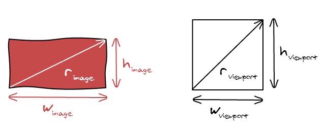
We are going to manipulate two rectangles in this article: the image we want to display and the viewport in which we want to display it. Each rectangle has three properties: a width (w), a height (h) and an aspect ratio (r).

image-viewport

The aspect ratio of an image is defined by the following formula: [r_{atio} = frac{w_{idth}}{h_{eight}}]

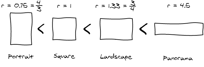
While there are an infinite amount of aspect ratios, we are going to be in contact with for major categories of aspect ratio when displaying photos on the internet.

ratios

Adapting the Image to the Viewport

Stretch the image

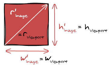
The naive way to adapt an image to a viewport is to set both the width and height of the image to match the viewport width and height.

stretch

However, doing that is going to stretch your image and make it look very bad.

car_resize car_resize car_resize

The problem with the previous scaling is that we didn’t respect one fundamental rule: the aspect ratio must remain constant after the transformation.

[r_{image} = r’_{image}]

Contain

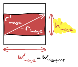
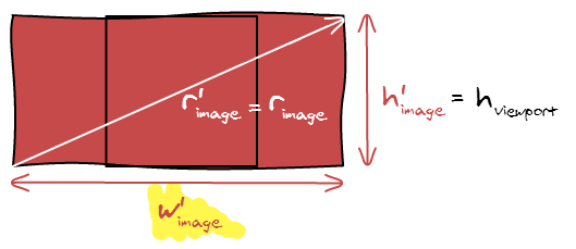
So, in order to make our image fit the viewport, we can make the image being contained in the viewport and have padding. Think black bars when you are watching a movie.

contain

In term of equations, we are setting the width of the image to be the width of the viewport: (w’_{image} = w_{viewport}). Since you also have (r_{image} = r’_{image}), and (r’_{image} = frac{w’_{image}}{h’_{image}}), it gets trivial to compute the remaining dimension.

[
h’_{image} = frac{w_{viewport}}{r_{image}}
]

Cover

There is another possibility, you can also make the image cover the viewport.

cover

Despite being conceptually different, the formula is nearly the same. Instead of fitting the width, we now fit the height and can compute the width the same way:

[w’_{image} = h_{viewport} * r_{image}]

Aspect Ratios?

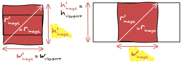
In our examples so far, we considered that the image was more horizontal than the viewport. What happens if we do the opposite: switch the image and the viewport dimensions. Check out the following image with all the new equations and unknowns.

Cover

Contain

contain_cover_rato

The similarities are striking. The formulas are exactly the same but inverted, cover is now using contain formula and vis versa. It makes it even easier to implement the algorithm, only two cases to handle.

Summary

Here is a summary of the formulas if you want to implement contain and cover.

table.contain-cover {
border-collapse: collapse;
}
table.contain-cover td, table.contain-cover th {
border: 1px solid #ccc;
padding: 5px 10px;
}

Contain Cover
(r_{image} le r_{viewport}) (w’_{image} = h_{viewport} * r_{image})
(h’_{image} = h_{viewport})
(w’_{image} = w_{viewport})
(h’_{image} = frac{w_{viewport}}{r_{image}})
(r_{image} ge r_{viewport}) (w’_{image} = w_{viewport})
(h’_{image} = frac{w_{viewport}}{r_{image}})
(w’_{image} = h_{viewport} * r_{image})
(h’_{image} = h_{viewport})

Hidden Area

We either introduced black bars or hidden some part of the photo. It’s interesting to see how much it accounts for. For example, if we only hide 2% of the image, then it may not be useful to run an algorithm to find the best cropping position.

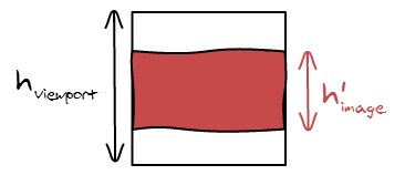
hidden area

The method is making sure that one of the dimensions is equal in both the adapted image and viewport, in this case the width. So all we are left to do is to compute the small height divided by the big height.

[hidden = frac{area’_{image}}{area_{viewport}} = frac{w’_{image} * h’_{image}}{w_{viewport} * h_{viewport}} = frac{h’_{image}}{h_{viewport}}]

We can repeat the process for the four other cases and come up with the following summary:

Contain Cover
(r_{image} le r_{viewport}) (hidden = frac{w’_{image}}{w_{viewport}}) (hidden = frac{h_{viewport}}{h’_{image}})
(r_{image} ge r_{viewport}) (hidden = frac{h’_{image}}{h_{viewport}}) (hidden = frac{w_{viewport}}{w’_{image}})

Note that in this case, we have to evaluate the four different possibilities. As this is a bit error prone and annoying to read all the cases, we can find another way to write it down. Let’s see what happens if we compare the ratios.

[frac{r’_{image}}{r_{viewport}} = frac{frac{w’_{image}}{h’_{image}}}{frac{w_{image}}{h_{viewport}}} = frac{w’_{image}}{h’_{image}} frac{h_{image}}{w_{viewport}} = frac{w’_{image}}{w_{viewport}} frac{h_{image}}{h’_{image}}]

We know that either the widths or the heights are equal. So it manages to find the proper two terms and the fraction. Now, nothing guarantees that they are in the good position. So we have either the result or (frac{1}{result}). As we know we want a number smaller than 1, we can just take the minimum of both.

[hidden = minleft(frac{r_{image}}{r_{viewport}}, frac{r_{viewport}}{r_{image}}right)]

Note: We were able to transform (r’_{image}) in to (r_{image}) because they are equal.

No Upscale

If you look closely at the formulas, we never actually use the width and height of the original image, we only use its aspect ratio. Therefore, if the original image is too small, it will be upscaled and appear very pixelated.

The easiest way to fix it is to compute the intended width and height, and make sure it is not bigger than the original width and height

[w’_{image} leftarrow min(w’_{image}, w_{image})][h’_{image} leftarrow min(h’_{image}, h_{image})]

And here is the result:

Conclusion

I wrote this article mainly in order to have a reference of all the formulas I wrote in the code and where they came from. All the formulas are really simple (I know, they look really scared in a computer screen unfortunately) and any time you want to display an image you have to play with their width, height and area. So it’s good to actually practice using them.

One key learning from this blog article should be that the aspect ratio is the most important thing that defines an image. Width and height are not actually that important as you are going to scale your image all the time. If you uses aspect ratio everywhere instead of width and height, your code is going to be a lot less error prone as we are already dealing with 2 other groups of width and heights: the scaled image and viewport size.

CSS – Displaying a Justified Line of Text

Now that I am working everyday with an awesome designer, I’m starting to discover the designer side of things. I got introduced to typography and realized how bad support for good typography was in the browsers. The tale to implement proper text layout algorithms started.

Line breaking and Hyphenation

I first read two fundamental papers on the algorithms that power TeX. The first one, written by Franklin Mark Liang, explains how to properly hyphenate words. When reading it in 2012, it is a bit unreal all the care taken to reduce memory as 20KB was a hard limit for the project. The second is written by Donald Knuth and Michael Plass and talks about finding when to break lines. It gives a very good introduction of all the subtleties behind the seemingly easy line breaking operation.

I was about to implement the papers when I realized that Bram Stein already wrote a Javascript version. Hypher to hyphenate and TypeSet for line breaking.

Displaying a line

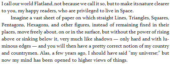
In all our examples, we are going to try and display the first two paragraphs of the novel Flatland by Edwin Abbott. I’ve seen this being used by two designers interested in typography so I guess I’m going to use it too!

Absolute Position Everything

The text algorithms give us for each character, its position in the paragraph. The first idea that comes to mind is to create one span for each element and absolutely position it in the DOM.

<span style="left: 0px; top: 23.2px;">I</span>
<span style="left: 5px; top: 23.2px;">&nbsp;</span>
<span style="left: 7.529411764705882px; top: 23.2px;">c</span>
<span style="left: 14.529411764705882px; top: 23.2px;">a</span>
<span style="left: 22.529411764705884px; top: 23.2px;">l</span>
<span style="left: 27.529411764705884px; top: 23.2px;">l</span>
<!-- ... -->

First thing to notice is the presence of &nbsp; instead of a white space. In HTML, white spaces around tags are generally omitted. This is useful as you can properly indent your HTML code and it will not add many unwanted white spaces in the result. It can also be annoying when you want to layout things with display: inline-block; but that is another problem. In this case, we use &nbsp; to force a real white space.

Then, we can see that position have decimal precision. Nowadays, browser implement sub-pixel rendering and we can use it to evenly space words in a line. This makes less abrupt spacing changes.

The first downside of this technique is the weight of the generated output. Having one DOM element per letter is highly inefficient, especially on mobile devices.

The second is about text selection. It varies widely between browser but usually double click to select a word is not working. The highlight is not contiguous, there are unwanted white spaces around letters/words. For some reason, when you use shift+right, you have to go two times right to highlight the next letter. And finally, when copy and pasting, n are not taken into account.

White Space Flexbox

The second approach is to display the text line by line and use real textNode for words instead of a DOM element for each character. The issue we are going to face from now on is to make sure spaces have proper width such that the line is justified.

The first technique I am going to present has been found by Kevin Lynagh. We are going to use flexbox to stretch the spaces such that they fill the available space.

<div class="line">
  I<span class="glue"> </span>
  call<span class="glue"> </span>
  our<span class="glue"> </span>
  world<span class="glue"> </span>
  Flatland,<span class="glue"> </span>
  not<span class="glue"> </span>
  <!-- ... -->
  clearer
</div>
.line {
  display: box;
  box-pack: justify;
  box-orient: horizontal;
}
 
.glue {
  flex: 1;
  display: block;
}

.glue {
flex: 1;
display: block;
}

The visual display is perfect as it properly set the width of the glue elements with sub-pixel precision. However, copy and paste is not working as intended. All the spaces are being replaced by n as glue elements are display: block;. Browser support of Flexbox is still early so this technique cannot be used on popular websites.

If you want to render links, this approach is going to be problematic when they span over two lines. You are going to have to break the tag into two. This means that people clicking on the first part will not see the second highlight. If you had any Javascript listeners, you are going to have to duplicate them … It is making things more complicated.

One-line Justify

We really want the browser to do the justification part, but by default, it will not justify only one line of text. The reason is that the last line of any paragraph is not going to be justified. Using a trick I explained in a previous blog article, we can force it to do so.

<div class="justify">
  I call our world Flatland, not because we call it so, but to make its nature clearer
</div>
<div>
  to you, my happy readers, who are privileged to live in Space.
</div>
.justify {
  text-align: justify;
  word-spacing: -10px;
}
 
.justify:after {
  content: "";
  display: inline-block;
  width: 100%;
}

.justify:after {
content: "";
display: inline-block;
width: 100%;
}

The browser will not stretch the white space below the width of a white space. It will consider that there isn’t enough room and put the last character on the next line and then justify. In order to force it to do so, we want to remove some pixels from spaces. We can do that using word-spacing: -10px;. You’ve got to make this value at least equal to the width of a white space not to worry about it anymore. Note: don’t make it too important (like -99999px) as if the computed line width is negative, the browser will not attempt to justify the text.

This technique is working on all the major browsers (IE>7) and very light in term of DOM overhead. The copy and pasted text is not perfect as there will be n at every end of line (80-columns newsgroup style) but is good enough. We still have the tag issue as the previous technique.

Word-spacing

The previous techniques found ways to let the browser compute the proper white space widths. We made all the hard work of finding the best line-breaks, so we know the widths of the white spaces. Why don’t we tell it to the browser. For each line, we can update the word-spacing accordingly. This is the technique used by TypeSet.

<p>
<span style="word-spacing: -1.4705882352941178px;">
  I call our world Flatland, not because we call it so, but to make its nature clearer&nbsp;
</span>
to you, my happy readers, who are privileged to live in Space.
</p>

It is however to good to be true. Webkit has a bug where fractional pixel values are not supported with word-spacing, it has been reported in 2008 but not yet being worked on by anyone. So if you really want to work with Webkit, you have got to distribute the fractional values between words.

<p>
<span style="word-spacing: -2px;">
  I call our world Flatland,&nbsp;
</span>
<span style="word-spacing: -1px;">
  not because we call it so, but to make its nature clearer&nbsp;
</span>
to you, my happy readers, who are privileged to live in Space.
</p>

The downside now is that the first few letters look really close to each other and the remaining letters are farther away. Since all the modifications we do is adding spans around, text selection and copy and paste are completely unaffected. We still have the issue however.

White Space Custom Width

If word-spacing doesn’t work, we can instead set the width of each white space by hand. We are going to update margin-left with the amount we would have sent to word-spacing.

Unfortunately, if you combine textNodes and spans with &nbsp;, the white span will not appear. You have to wrap the textNode in a span. This makes the DOM more complicated than it should have been.

One last detail is that for some reason, the browser will not add any line break. Therefore you have to insert your own br tags.

<p>
<span>I</span><span style="margin-left: -1.4705882352941178px;">&nbsp;</span>
<span>call</span><span style="margin-left: -1.4705882352941178px;">&nbsp;</span>
<!-- ... -->
<span>nature</span><span style="margin-left: -1.4705882352941178px;">&nbsp;</span>
<span>clearer</span><span style="margin-left: -1.4705882352941178px;">&nbsp;</span>
<br />
to you, my happy readers, who are privileged to live in Space.
</p>

This technique doesn’t suffer from the problem. The text copy and pasted still have n at the end of each line. It enables sub-pixel text position in Chrome. The main downside is that it adds two new DOM elements per word.

Horizontally Scale the Line

In pdf.js, they write all the text into a canvas but display transparent text on-top in order to get browser selection. Instead of handling justification properly, they cheat and scale the text horizontally to fit the width.

<div style="transform: scale(0.9545764749570032, 1); transform-origin: 0% 0%;">
  These detailed metrics allow us to estimate parameters for a
</div>
<div style="transform: scale(0.9401883384450235, 1); transform-origin: 0% 0%;">
  simple model of tracing performance. These estimates should be
</div>

The trick works because the text is not being displayed. If you attempt to scale horizontally your text to fit the width of your page, you are going to see very bad scaling artifacts on your letters.

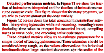
This technique is not quite what we want. It scales both letters and white spaces where we only want to scale white spaces. Therefore, the displayed text and the overlaid text do not always exactly match as seen in the image:

I’m not 100% sure what their constraints are but I’m hopeful that the one line justify trick would improve their text selection.

End of Line Padding

What we really want to do is to put a <br /> at the end of all the lines and let the browser justify for us. Unfortunately, this is not working, the browser doesn’t justify when there are <br />. Instead, we can exploit the fact that the browser uses a first-fit method to break the lines and force it to break where we want it to.

At the end of each line, we are going to add a empty span element that has the dimensions of the remaining space in the line. This way, the browser is going to see that the text and white space and our element make a full line, and then go to the next line.

Now, we really don’t want this element to appear, or it would just be the equivalent of a text-align: left;. Here is the trick, the margin-right property of the last element of the line is being ignored after the browser line-breaking algorithm.

<p style="text-align: justify;">
  I call our world Flatland, not because we call it so, but to make its nature clearer
  <span style="margin-right: 132px;"></span>
 
  to you, my happy readers, who are privileged to live in Space.
</p>

to you, my happy readers, who are privileged to live in Space.
</p>

It works like a charm when you don’t need to go below the default white-space size. If you do, then things get a little bit more complicated. We have to use word-spacing: -10px but then, the last line is going to be using this spacing instead of the default one.

The solution is to use our justify class from before that forces the last line to be justified and add an element at the end with the proper size to fill up the space. This time, we want the width of this element to remain after the line-breaking algorithm. So instead of doing a margin-right, we are just going to do margin-left.

<p class="justify">
  I call our world Flatland, not because we call it so, but to make its nature clearer
  <span style="margin-right: 132px;"></span>
 
  to you, my happy readers, who are privileged to live in Space.
  <span style="margin-left: 115px;"></span>
</p>

to you, my happy readers, who are privileged to live in Space.
<span style="margin-left: 115px;"></span>
</p>

This solution doesn’t suffer from the issue as we don’t wrap lines into an element. It doesn’t affect copy and paste as the end of line elements are empty and inline. It is also very lightweight as we only add one DOM element at the end of each line. And, it is cross-browser and supports sub-pixel word positioning.

Conclusion

By default, the browser doesn’t let you hint where you want it to break in a justified paragraph, we have to send carefully crafted inputs to exploit the way its internal rendering algorithm work. If you are to use one of the described techniques, use the last one as it solved all the pain points the others have.

You can test all of them using this JSFiddle Demo. Note: they have been hard-coded to work on Chrome Windows. If you are not using both, then it will likely be all screwed up because the font size is not the same and browser prefixes have not been added.


Beware of one pixel resizing

When displaying images naively, you may end up losing image quality because of a relatively unknown phenomena. If you happen to display an image with a dimension that is one pixel off the real image dimension, the resizing operation (which is costly in the browser) is going to be the equivalent of a blur. See the following example:

130×130 129×129

When you look at it from an external perspective, it seems to be very intentional to display and image with a dimension that is one pixel off. However it can happen for many reasons, some are bugs and some are legitimate.

Grid Sizes

Let’s say the content area where you want to display a 4-columns image grid has a width of 500 pixels. And you want to have the same padding in the edges as in-between the images.

[4 * image{ }width + 5 * padding = 500][image{ }width = frac{(500 – 5 * padding)}{4}]

The only padding value between 2px and 8px that give an integer number for the image width are 4px and 8px. But unfortunately, none of them look good, you really want 6px padding.

120×120 and 4px padding.

115×115 and 8px padding.

In this case, you want to cheat and don’t have all the same width and padding but make some of them 1 pixel smaller.

You can for example say that edges will have 5 pixel and inside 6 pixels. However this is a bad idea because it is going to be visually visible. By changing from 5 to 6 you are doing a variation of 17%.

[5 + 118 + 6 + 118 + 6 + 118 + 6 + 118 + 5 = 500]


118×118 and 5px padding on the sides, 6px padding in-between.

Instead you want to borrow a pixel from the images. Having two with 127px width and two with 128px width. The difference is not visible by the eye.

[6 + 117 + 6 + 118 + 6 + 117 + 6 + 118 + 6 = 500]


117×118 and 118×118 alternated and 6px padding.

So now we are in a situation where we want to display an image with 1 less pixel. In order to do that without bluring the image, the trick is to use a container with the size you want to display with overflow: hidden; and inside the properly sized image.

<div style="overflow: hidden; width: 129px; height: 129px;">
  <img src="130x130.png" width="130" height="130" />
</div>
130×130 129×129

Chrome bug

Being one pixel off is really easy, the main cause is different rounding. One one part of the code you use round() and in another part you use floor(). If the number is decimal, you have half chances to get a wrong result. For example, there is currently a bug in Chrome where hardware accelerated rendering has similar issue.

In order to get good scrolling performance, we enable hardware acceleration using transform: translateZ(0); on all the visible images on the viewport. However, when we mouse over an image, we display some overlay and therefore decide to remove hardware acceleration for it to avoid thrashing GPU memory.

To display images, we use a container as described above with the CSS property left: -7.92%; to position the image properly in the viewport. The result is that the image is moving around when you mouse hover it on Chrome. There is probably a different rounding applied between the CPU and the GPU code. The net effect is the image being resized by one pixel and blurry by default. When you mouse over, the image has the correct size.

#hover_hardware_acceleration { -webkit-transform: translateZ(0); } #hover_hardware_acceleration:hover { -webkit-transform: none; } #hover_hardware_acceleration:hover #hover_label { display: block; } #hover_label { display: none; }

In order to fix the issue, we can use integer number in pixel left: -24px; instead. This way the browser doesn’t have to round anything.

#hover_hardware_acceleration { -webkit-transform: translateZ(0); } #hover_hardware_acceleration:hover { -webkit-transform: none; } #hover_hardware_acceleration:hover #hover_label { display: block; } #hover_label { display: none; }

This is only one of the many similar issues with the browsers handling rounding differently. People implementing fluid layout suffer a lot because of browser inconsistencies. If this is happening in browser implementations, there is also a high probability that this issue is going to appear in your own code if you didn’t make sure it was rounding as expected.

Conclusion

This problem is very common and comes from many different sources, but always because of the same root cause: rounding issues. Since sub-pixel rendering is not widely implemented, it is not going to disappear. I hope that you are now aware of it and will address it to avoid affecting image quality of your thumbnails 🙂