In a previous article I explained how CSS Percentage Background Position was working. This time I'm going to talk about the two ways to resize an image to a viewport: contain and cover. This is such a fundamental operation that I explained all the formulas and where they come from. They are the base for anything more complicated you want to do with images.
Definitions
We are going to manipulate two rectangles in this article: the image we want to display and the viewport in which we want to display it. Each rectangle has three properties: a width \(w\), a height \(h\) and an aspect ratio \(r\).
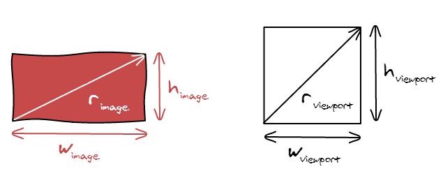
The aspect ratio of an image is defined by the following formula: \[r_{atio} = \frac{w_{idth}}{h_{eight}}\]
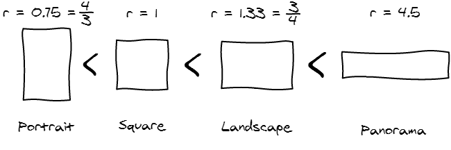
While there are an infinite amount of aspect ratios, we are going to be in contact with for major categories of aspect ratio when displaying photos on the internet.
Adapting the Image to the Viewport
Stretch the image
The naive way to adapt an image to a viewport is to set both the width and height of the image to match the viewport width and height.
However, doing that is going to stretch your image and make it look very bad.
The problem with the previous scaling is that we didn't respect one fundamental rule: the aspect ratio must remain constant after the transformation.
\[r_{image} = r'_{image}\]
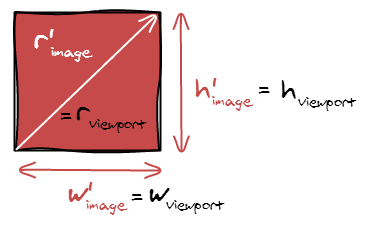
Contain
So, in order to make our image fit the viewport, we can make the image being contained in the viewport and have padding. Think black bars when you are watching a movie.
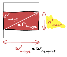
In term of equations, we are setting the width of the image to be the width of the viewport: \(w'_{image} = w_{viewport}\). Since you also have \(r_{image} = r'_{image}\), and \(r'_{image} = \frac{w'_{image}}{h'_{image}}\), it gets trivial to compute the remaining dimension.
\[
h'_{image} = \frac{w_{viewport}}{r_{image}}
\]
Cover
There is another possibility, you can also make the image cover the viewport.
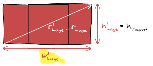
Despite being conceptually different, the formula is nearly the same. Instead of fitting the width, we now fit the height and can compute the width the same way:
\[w'_{image} = h_{viewport} * r_{image}\]
Aspect Ratios?
In our examples so far, we considered that the image was more horizontal than the viewport. What happens if we do the opposite: switch the image and the viewport dimensions. Check out the following image with all the new equations and unknowns.
Cover
Contain
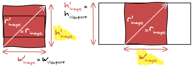
The similarities are striking. The formulas are exactly the same but inverted, cover is now using contain formula and vis versa. It makes it even easier to implement the algorithm, only two cases to handle.
Summary
Here is a summary of the formulas if you want to implement contain and cover.
| Contain | Cover | |
|---|---|---|
| \(r_{image} \le r_{viewport}\) | \(w'_{image} = h_{viewport} * r_{image}\) \(h'_{image} = h_{viewport}\) |
\(w'_{image} = w_{viewport}\) \(h'_{image} = \frac{w_{viewport}}{r_{image}}\) |
| \(r_{image} \ge r_{viewport}\) | \(w'_{image} = w_{viewport}\) \(h'_{image} = \frac{w_{viewport}}{r_{image}}\) |
\(w'_{image} = h_{viewport} * r_{image}\) \(h'_{image} = h_{viewport}\) |
Hidden Area
We either introduced black bars or hidden some part of the photo. It's interesting to see how much it accounts for. For example, if we only hide 2% of the image, then it may not be useful to run an algorithm to find the best cropping position.
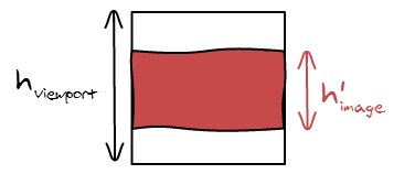
The method is making sure that one of the dimensions is equal in both the adapted image and viewport, in this case the width. So all we are left to do is to compute the small height divided by the big height.
\[hidden = \frac{area'_{image}}{area_{viewport}} = \frac{w'_{image} * h'_{image}}{w_{viewport} * h_{viewport}} = \frac{h'_{image}}{h_{viewport}}\]
We can repeat the process for the four other cases and come up with the following summary:
| Contain | Cover | |
|---|---|---|
| \(r_{image} \le r_{viewport}\) | \(hidden = \frac{w'_{image}}{w_{viewport}}\) | \(hidden = \frac{h_{viewport}}{h'_{image}}\) |
| \(r_{image} \ge r_{viewport}\) | \(hidden = \frac{h'_{image}}{h_{viewport}}\) | \(hidden = \frac{w_{viewport}}{w'_{image}}\) |
Note that in this case, we have to evaluate the four different possibilities. As this is a bit error prone and annoying to read all the cases, we can find another way to write it down. Let's see what happens if we compare the ratios.
\[\frac{r'_{image}}{r_{viewport}} = \frac{\frac{w'_{image}}{h'_{image}}}{\frac{w_{image}}{h_{viewport}}} = \frac{w'_{image}}{h'_{image}} \frac{h_{image}}{w_{viewport}} = \frac{w'_{image}}{w_{viewport}} \frac{h_{image}}{h'_{image}}\]
We know that either the widths or the heights are equal. So it manages to find the proper two terms and the fraction. Now, nothing guarantees that they are in the good position. So we have either the result or \(\frac{1}{result}\). As we know we want a number smaller than 1, we can just take the minimum of both.
Note: We were able to transform \(r'_{image}\) in to \(r_{image}\) because they are equal.
No Upscale
If you look closely at the formulas, we never actually use the width and height of the original image, we only use its aspect ratio. Therefore, if the original image is too small, it will be upscaled and appear very pixelated.
The easiest way to fix it is to compute the intended width and height, and make sure it is not bigger than the original width and height
And here is the result:
Conclusion
I wrote this article mainly in order to have a reference of all the formulas I wrote in the code and where they came from. All the formulas are really simple (I know, they look really scared in a computer screen unfortunately) and any time you want to display an image you have to play with their width, height and area. So it's good to actually practice using them.
One key learning from this blog article should be that the aspect ratio is the most important thing that defines an image. Width and height are not actually that important as you are going to scale your image all the time. If you uses aspect ratio everywhere instead of width and height, your code is going to be a lot less error prone as we are already dealing with 2 other groups of width and heights: the scaled image and viewport size.