Lightbox.com has a really interesting image layout algorithm. We're going to see how it works and its best use case.
How does it work?
Column based
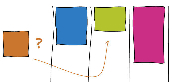
The algorithm is column based. You pick a number of columns at the beginning. Then every time you want to layout an image, you just place it to the smallest column.

Some facts about this layout: All the images here have the same width. The order is not particularly respected. The end of the stream is not properly aligned.
Bigger Images
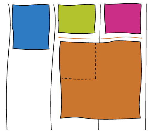
The interesting part of Lightbox layout is the ability to make some images bigger. When you are about to layout an image, you look at the height of the neighbor columns. If the column has the same size, then you can to extend the image to take the width of both columns.

Beating the Odds
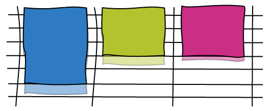
Having two adjacent columns with the exact same size is rarely going to happen in practice. In order to solve this situation we are going to cheat a little. We draw an invisible grid and every time an image doesn't perfectly align with the grid, we crop it to the nearest line.

The bigger the grid is, the more opportunity you will have to make bigger images but at the same time, the more you will crop your images.
When to make images bigger?
This might be counter intuitive but you don't want to make images bigger every time the opportunity present itself. Every time you make an image bigger, it is going to preserve two adjacent columns of the same height. If you keep adding bigger images on top of those two column, you essentially created a column that has twice the width.
Using a column based layout implies that landscape images are much smaller than the portrait ones. In order to restore balance, Lightbox uses the following heuristic. If the image is landscape, then it has 60% chance to be made bigger, only 10% when it is a portrait.
Conclusion
Check out the Demo!
This layout is very good for random collection of images in an infinite stream. Here's a little Pro/Con to know if this technique will fit your needs.
Pros:
- Can make some images bigger
- No holes
- Need to store only two dimensions per image
- Arbitrary number of columns
Cons:
- Landscape images are much smaller than portrait ones
- Images that can be bigger is very arbitrary
- Small cropping
- Order is not respected
- End of stream is not well aligned
Some other implementations I found on the internet:
- David DeSandro: jQuery Masonry plugin that uses a similar technique.
- Miller Medeiros: Resize the browser :).

