In this article, we are going to see how to support dynamic updates to Facebook Image Layout Algorithm. Beware, this is not an easy task and there are many special cases to handle 🙂
Making images bigger
To make images bigger we just run the algorithm all over again with the new image being big. For example, making b big will lead to the following layout.
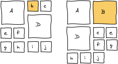
In order to make it a better user experience, we want to smoothly transition the images positions and sizes. We do it using CSS Transitions. In Javascript, we update the size and dimension of all the elements and add 2 lines of CSS to get the magic.
transition-property: top, left, width, height; transition-duration: 500ms; |
Reordering
Let's start with a small example. We want to move b where d is.
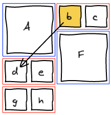
The first thing we do is to remove b from the list of elements. Then, we rerun layout algorithm until we are about to add a block at the spot where we want b to be.
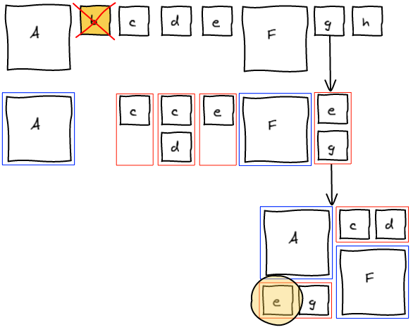
Insert Before
At this point, we realize that b needs to be at the spot where e is. The natural answer is to insert b right before e and re-run the layout algorithm.
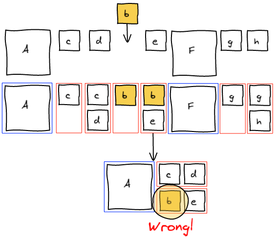
However this is not working as expected. Adding b before e groups them together before F.
Insert and canonicalize
The previous method tried to change the past. One knows that changing the past also changes the future 🙂 Instead, what we want to do is to fix the present and let time go on. We are going to insert b to the temporary block, layout that block and insert g (that was previously in the temporary block) right after in the list. This way, we get the layout we wanted.
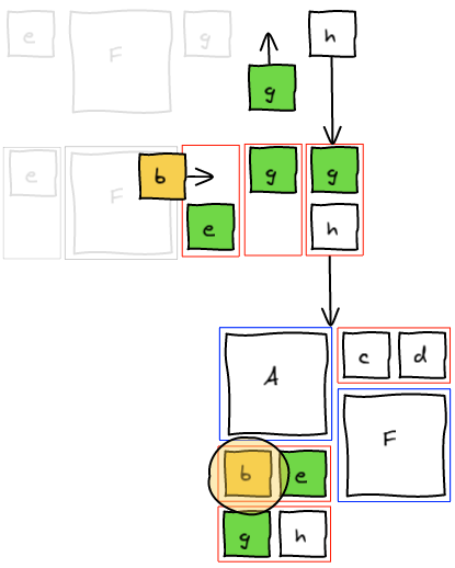
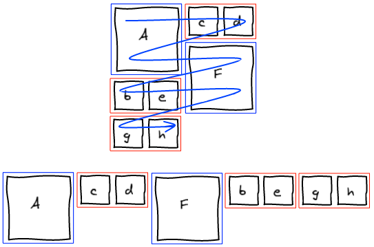
At this point, we completely blew up the sequence that lead to this layout. Instead of trying hard to move elements around to get a valid sequence, we're going to be smarter. We managed to get the layout we wanted. Well, let's just read that layout and build a valid sequence out of it. I call this a canonical sequence.
Handle all the cases!
Now that we have the general framework, we need to see how to "fix the present" in all the different cases.
Small -> Small

As seen in the example, we insert the small element at the right position in the block and move the last element of the block back into the list of elements to be processed.
Big -> Small | Big -> Top of Big


Those two cases are also really easy. We layout the big element we are trying to insert and then layout the block without any modification.
Small -> Top of Big
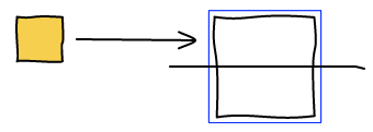
This one is more tricky. We want to find another small image so that we've got two to form a small block.
- If at this point, there's a temporary small block that is not empty, then perfect, we add the small image we want to insert at the end of the block and layout it.
- If not, we're going to look for the first small image in the list of elements left to be processed. With this image, we're going to form a small block and layout it. Note: if there are many big images, the small image can be pulled from quite a long distance.
- If there's no small image left, we're going to layout a small block with only the image we want to insert. We'll discuss why it is okay later.
Small -> Bottom of Big | Big -> Bottom of Big
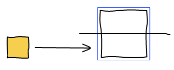
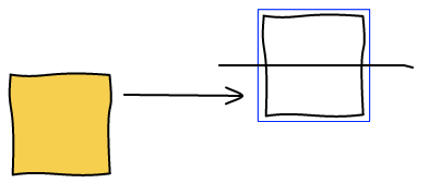
And now comes the hard part. First, you've got to be warned, there isn't always a solution for this problem. For example, whatever ordering you chose, you are never going to be able to move D at the bottom of A.
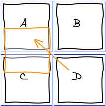
Let's take an example where it is actually possible. We want to move D at the bottom of A.
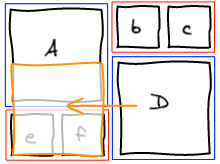
We start the algorithm and run into the conflicting situation on the first element.
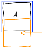
The idea here is to pull small elements from the rest of the list in order to make a small block at this position. Once it is done, the other column is going to be filled with the big block that was conflicting and we're back to the column we were initially. Only this time, we are one row lower. And this makes a big difference. Whatever we are about to layout here is either a small block or the top of a big block. We already know how to handle those two cases.
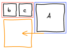
If there isn't enough small elements remaining in the stream to form a small block, we're not able to find a solution. There may be a solution if we allow to update the past, but as we've seen earlier, this is a tricky business.
We cannot just stop here and raise an error: no solution found. Instead, a trade-off we can make is to put the element we are trying to insert at the top of the big block instead of the bottom. This is obviously not perfect but is the best user experience I was able to find.
Last small element
The last issue we're going to cover in this article is how to handle the last small element. Imagine we're in the situation where there are 2 images, one big and one small. You are trying to move the small element before the big one.
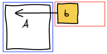
With the algorithm I explained, you are never going to be able to handle this case. There are only two possible ordering: Ab and bA. But both put the big image first and the small image second.
Priority on small blocks
The main issue here is that the big block has the priority over the small one. You can change the algorithm such that as soon as you see a small element, you pull the next small one from the list to make a block. This fixes the issue here but introduces a side effect when making photos bigger.
In a canonical stream, when you make an image bigger, you've got a nice property that it always expand in the same column and to the bottom.
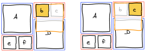
When you change the priority, the other small image of the block is going to take precedence. Therefore the (now bigger) image is going to move to the other column. This is not a good user experience.
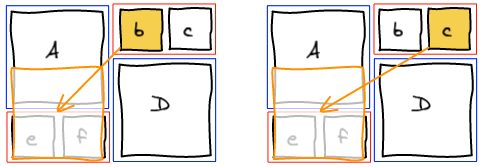
We could reorder the stream and move the image at the right position using the algorithms we've seen previously. However, not all the streams are reorderable. In Facebook case, only the photos in an album are reorderable. All the other streams are sorted by time, so reordering is not acceptable.
Priority on small blocks with only one image
The solution is to change the priority but only for a special case: when there are no more small images left to make a full small block. We still maintain all the benefits of having small blocks having a lower priority than big blocks, but at the same time fix the issue with the last lonely small block.
Bigger Images and Ordering
When making images bigger, we change the order of the stream as seen previously. For example, let's make b bigger in the following example.

So far so good, B expanded in its column and below. Now we are going to make a bigger.

And ... it's unexpected ... A and B just swapped behind our eyes for no apparent reason. You have to understand the algorithm to figure out what is going on. a when small was put after B because it didn't have the precedence. But, when you make A big, it gets back its precedence.
Canonicalize
A solution is to canonicalize the stream every time you highlight an image. This fixes the issue we described but introduces another one. Making a photo bigger is intuitively an operation that is reversible. When we make an image bigger and right after make it smaller, we expect that we get back to the original position. If you canonicalize after making it bigger, this property no longer holds true.
In the following example, a and b get inverted after making b bigger then smaller.
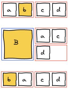
Since we cannot reorder images in the stream in Facebook, we did not try to find a better solution. We just stay with the unexpected behavior.
Conclusion
Check out the Demo! (Note: this is an earlier version, the most obscure tricks are not handled the same way and don't work all the time)
The transition from a static layout algorithm to a dynamic one was not an easy task. But in the end, we've been able to figure out all the edge cases and have a solution for each of them.
The issues arise when there are many big images and not enough small ones to do the various balancing operations. Hopefully the user are going to be moderate and don't make all the images of their stream big 🙂
